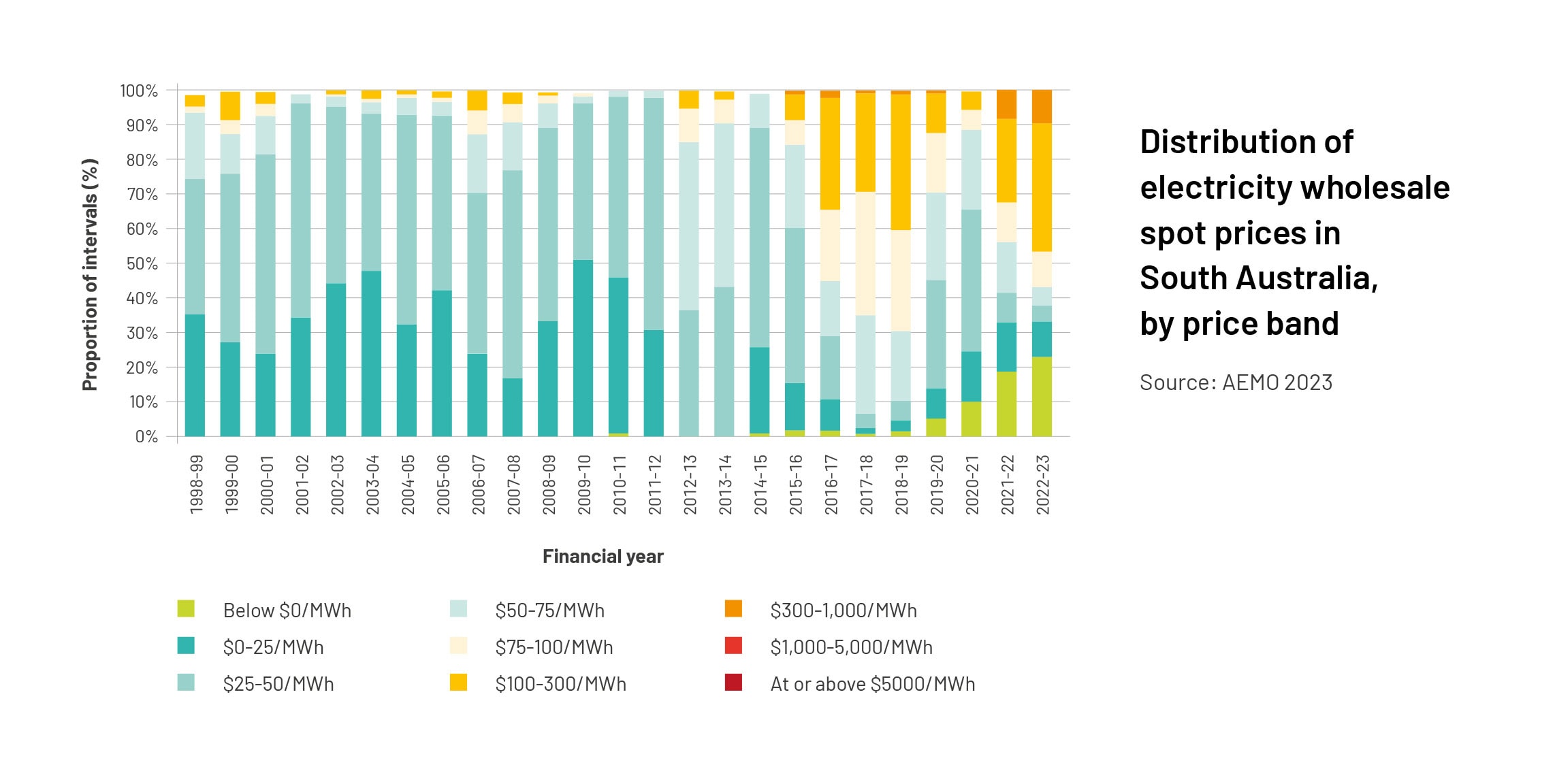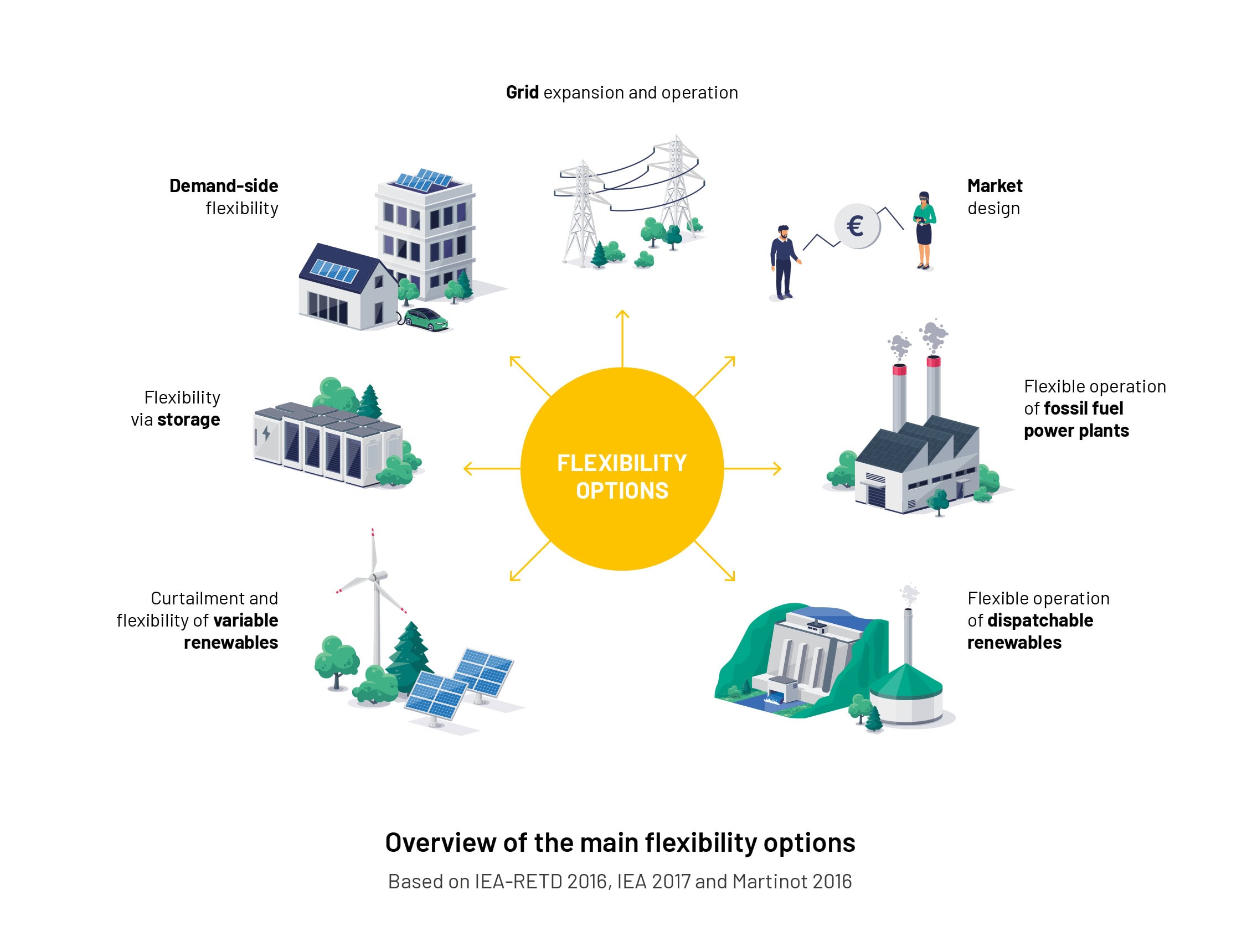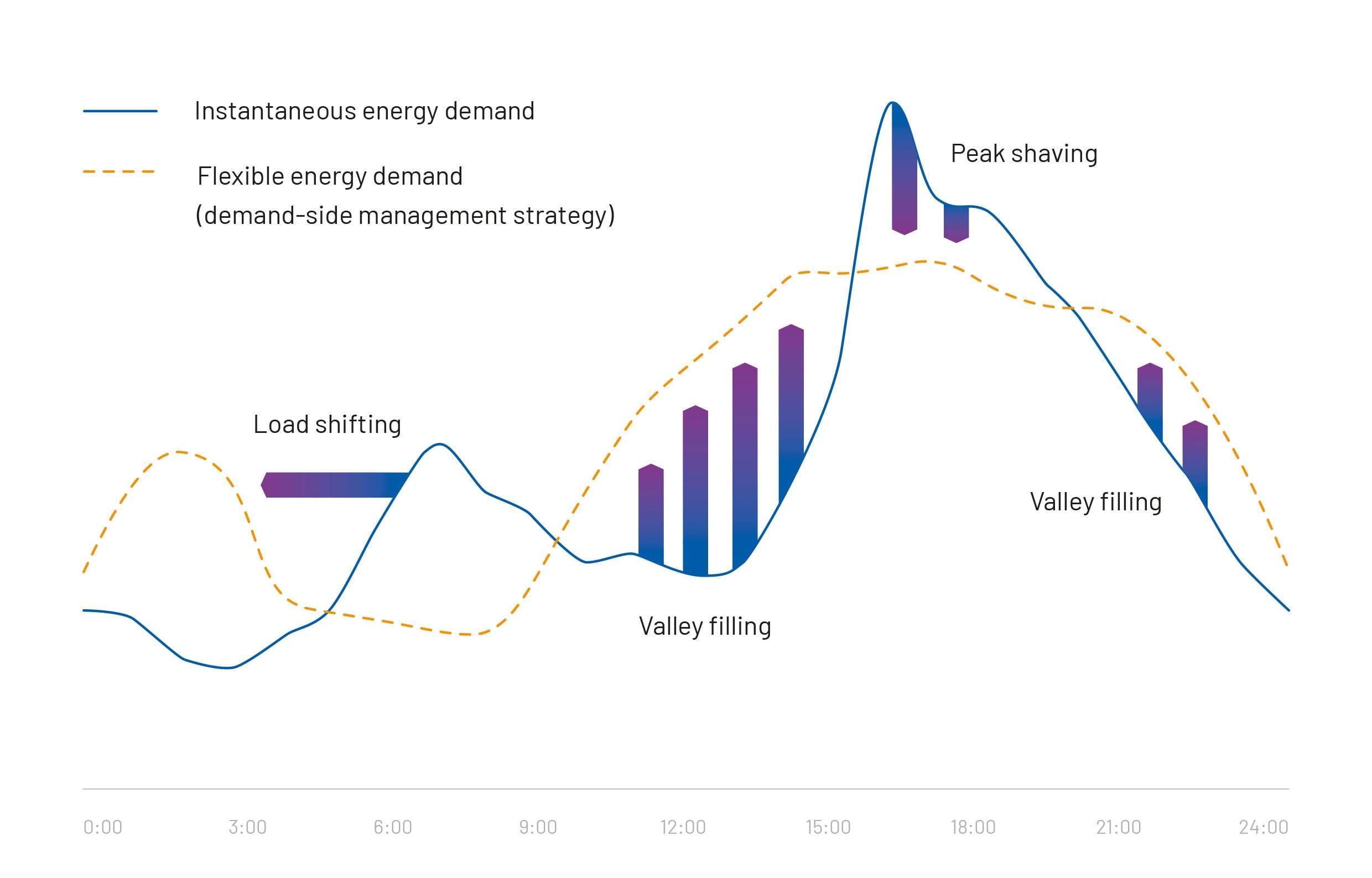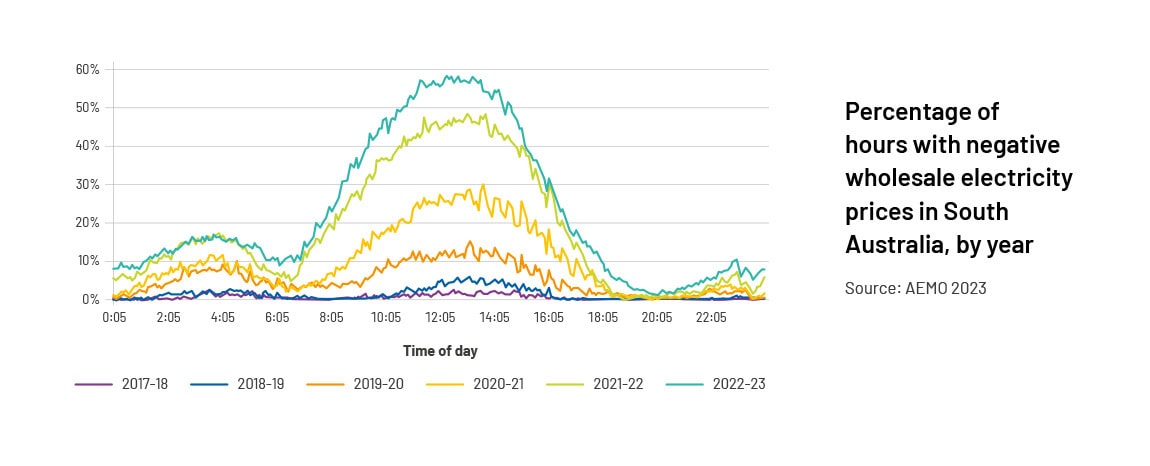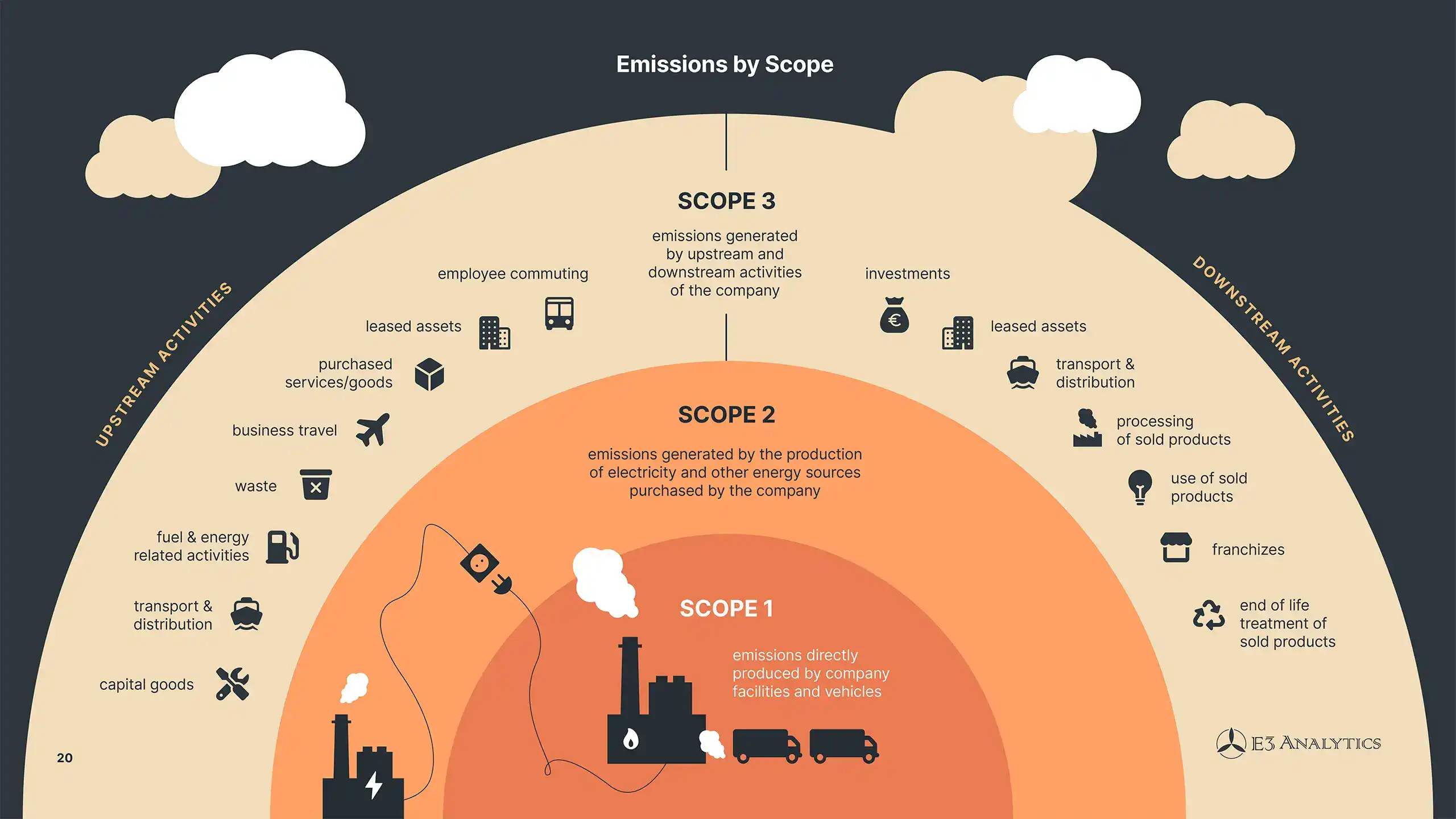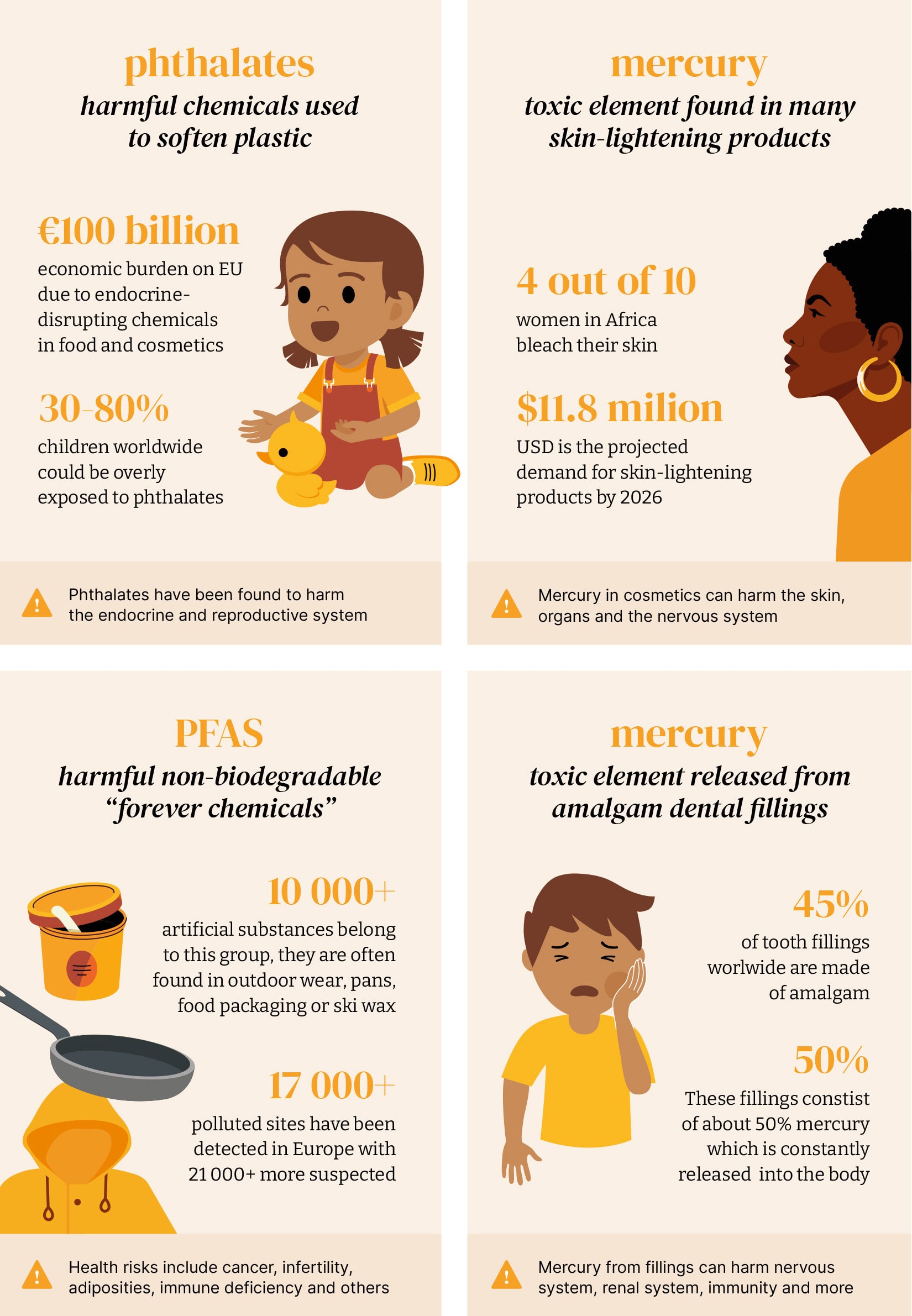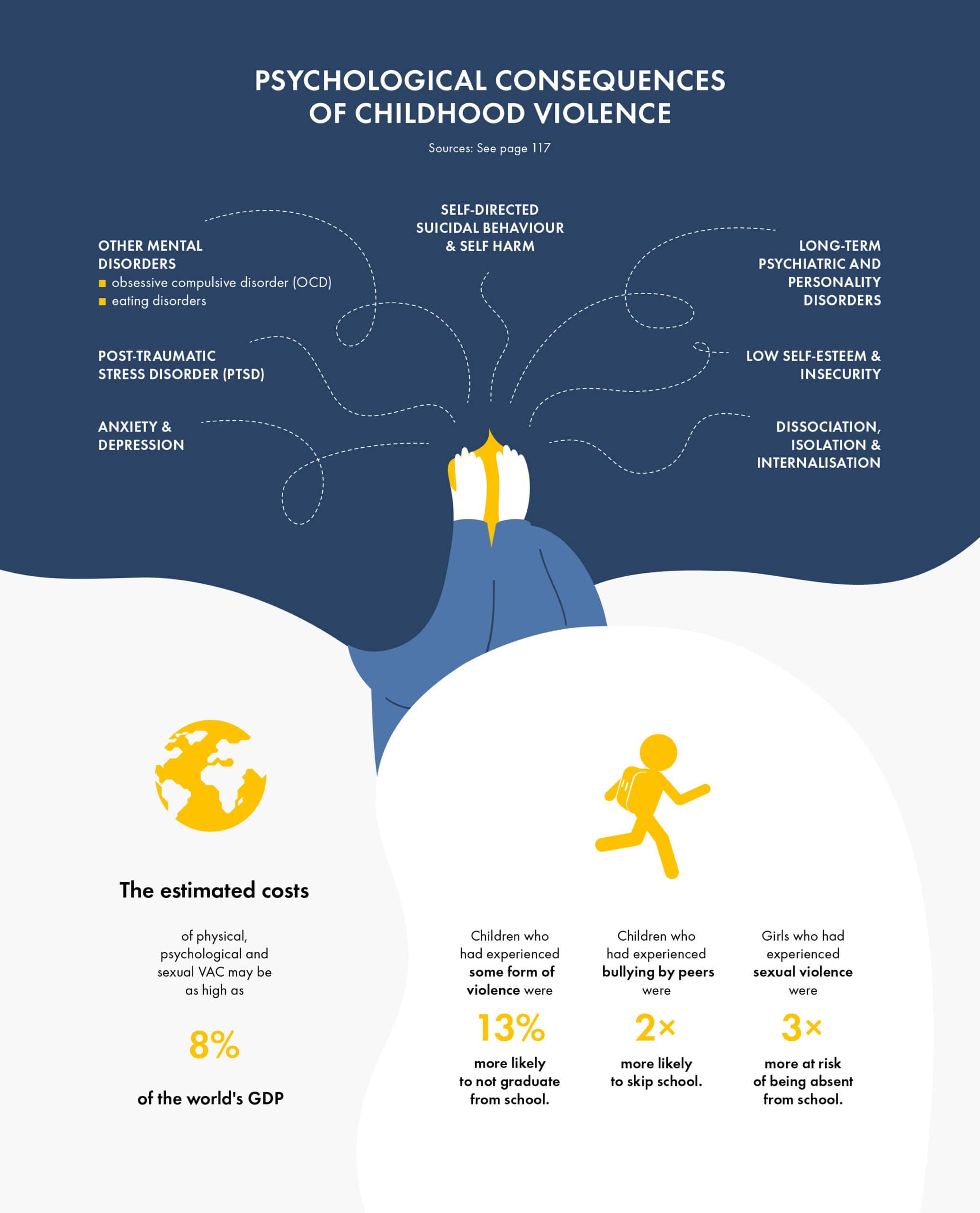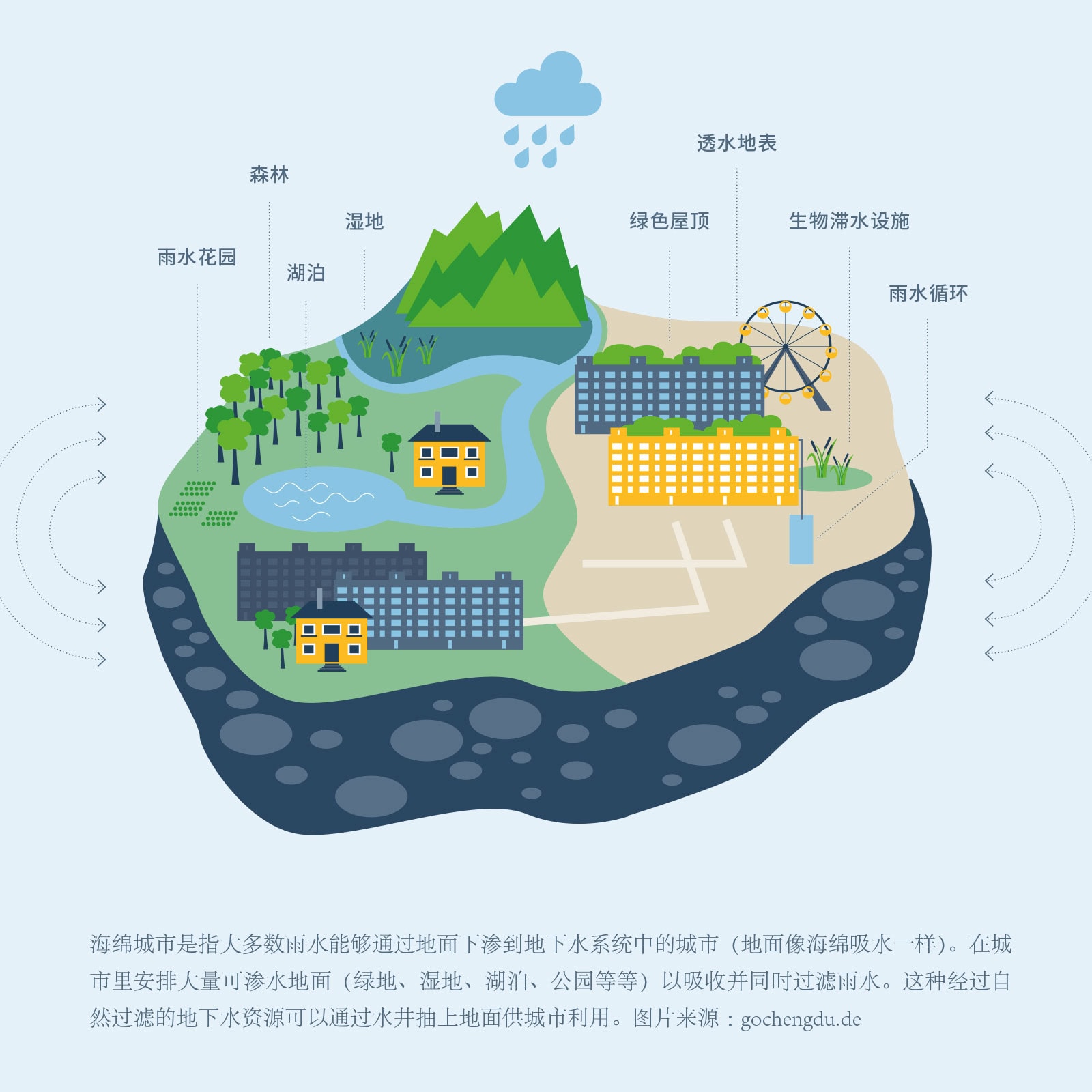
Charts, infographics, schemas, icon systems, and persistent visual structures across pages – the work that turns raw data into something readers can follow and understand. For policy reports, annual reports, research publications, and standalone graphics.
Specialist work that few designers offer: taking a dataset, a statistic, or a complex finding and giving it a visual form that makes it land. Not a chart pulled from a template but a composition reasoned and built for this particular number, this particular message, this particular reader.
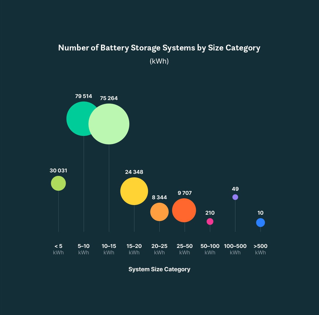
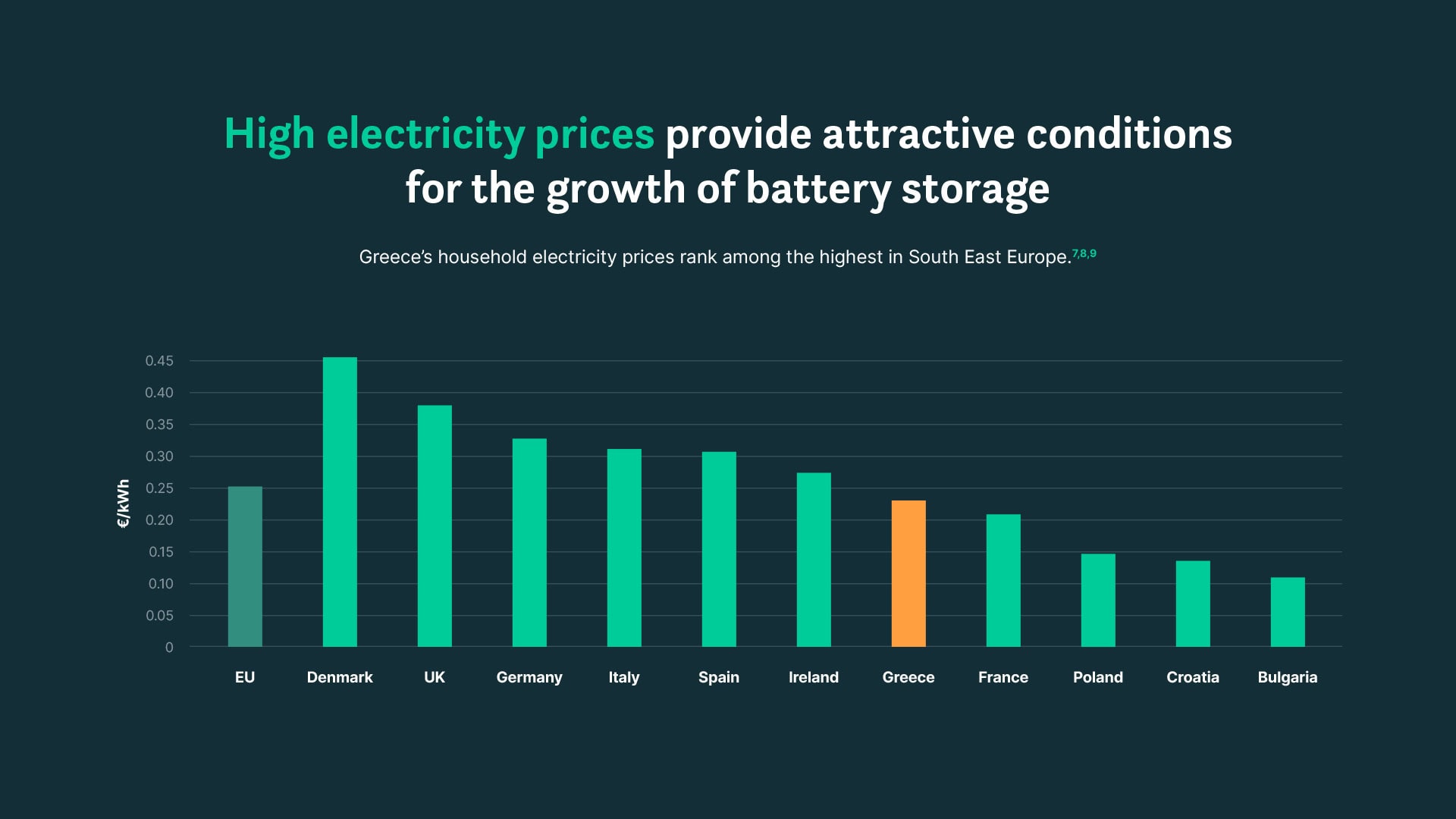
When the point is how things stack up – countries against each other, this year against last, one scenario against another – the design has to make the difference visible at a glance. I build visual systems that let readers compare without doing the arithmetic themselves.
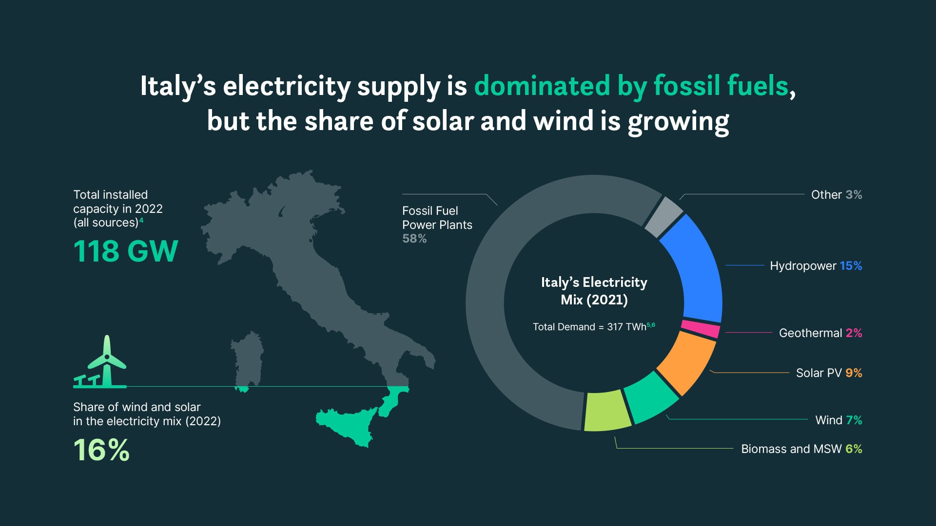
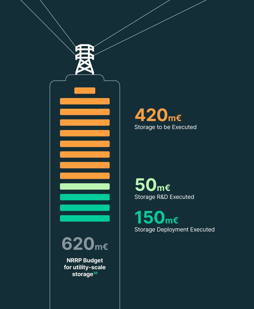
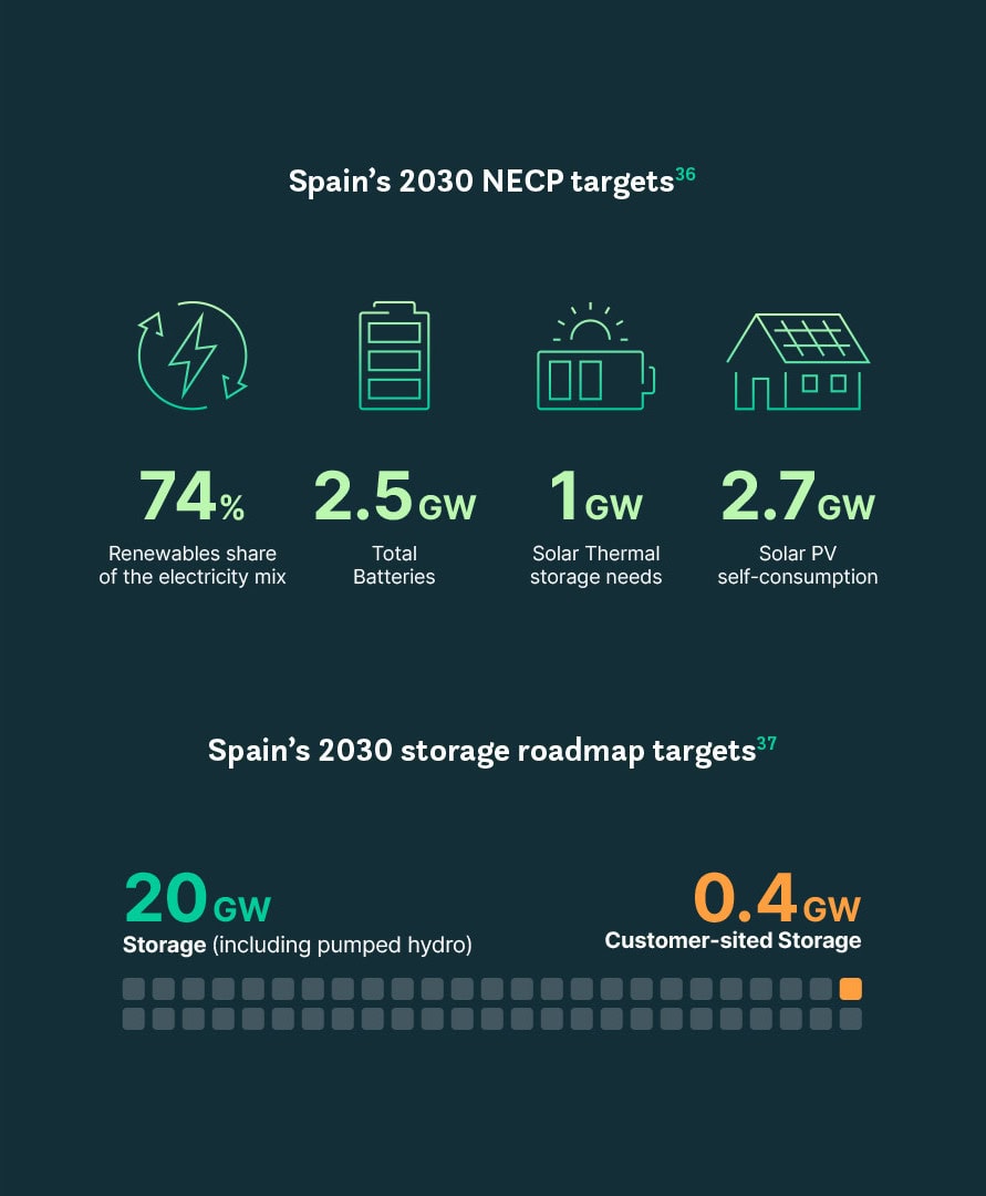
A number lands faster when it appears inside the thing it describes: a country’s storage capacity as a fill level within its own borders, energy demand as the charge of a battery. The subject becomes the chart, and the reader knows what the figure means before reading a single word.
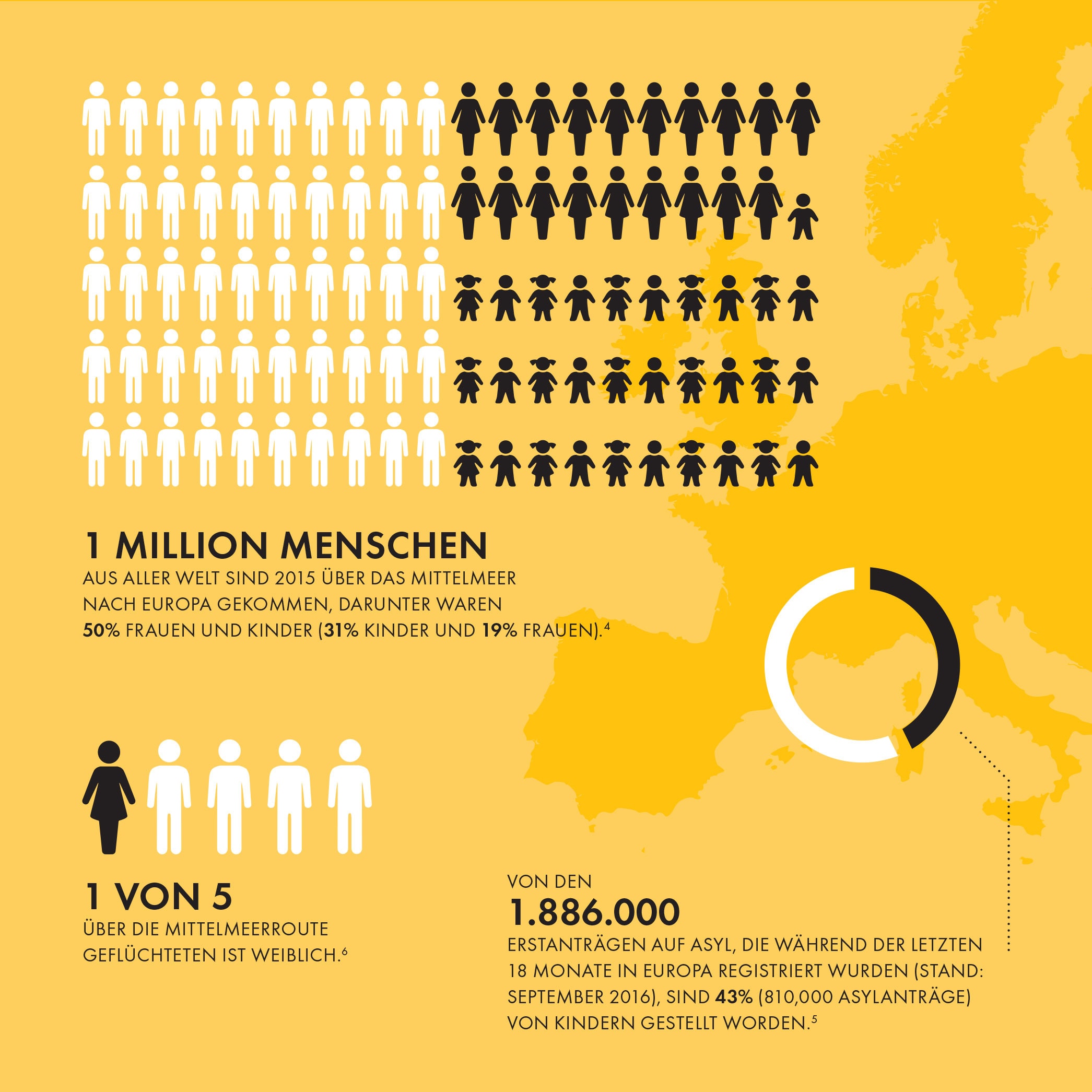
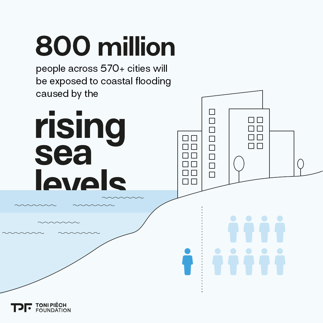
Some numbers are too big to feel. A budget, a volume of emissions, a population. They stay abstract until they’re given a shape. I design compositions that make scale viscerally legible, so readers don’t just read the figure, they grasp it.
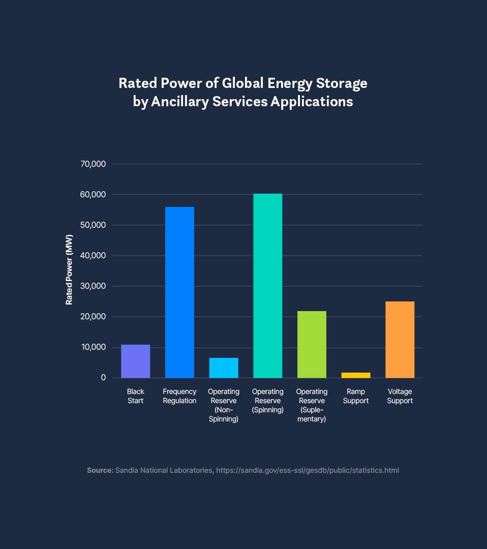
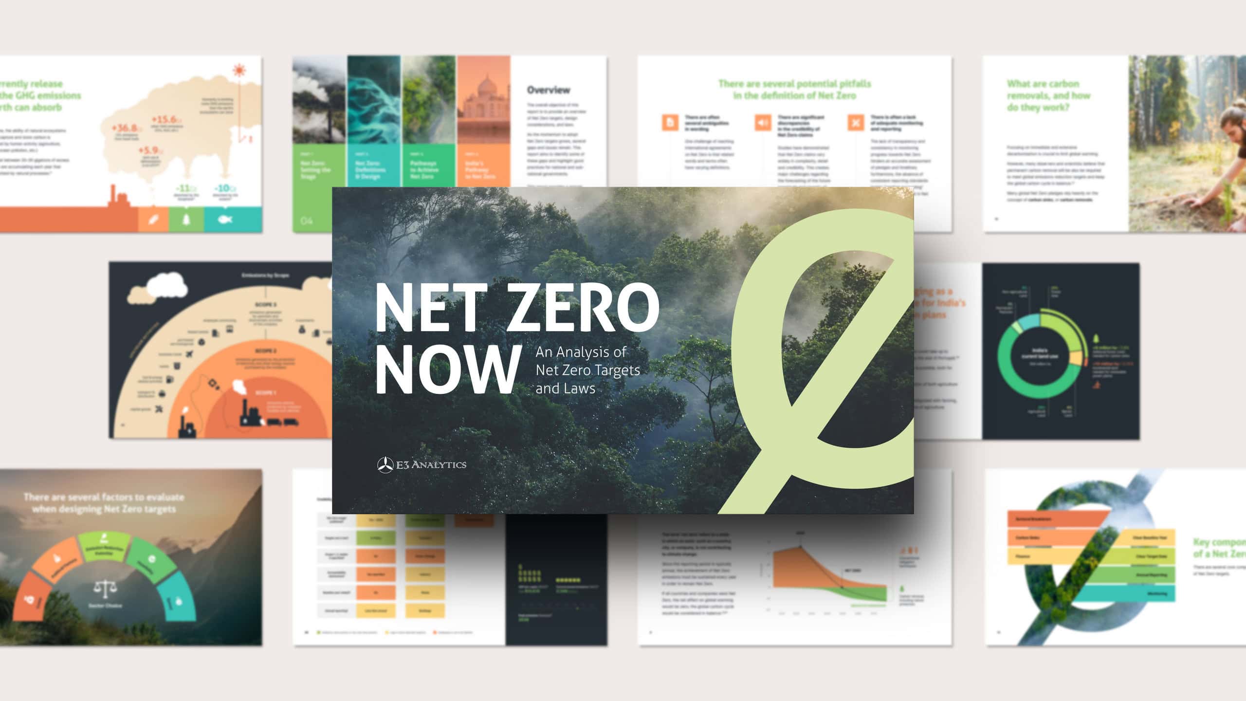
Most reports arrive with charts pulled from spreadsheets, borrowed from sources, built in different tools at different times. I bring them into one consistent, considered visual system across the whole publication.
One visual system per publication – switch between the reports to see three different styles.
The strongest data visuals often start before any design, in a conversation about what the data is really saying and how to carry it to the reader. I offer this concept work as a service in its own right.
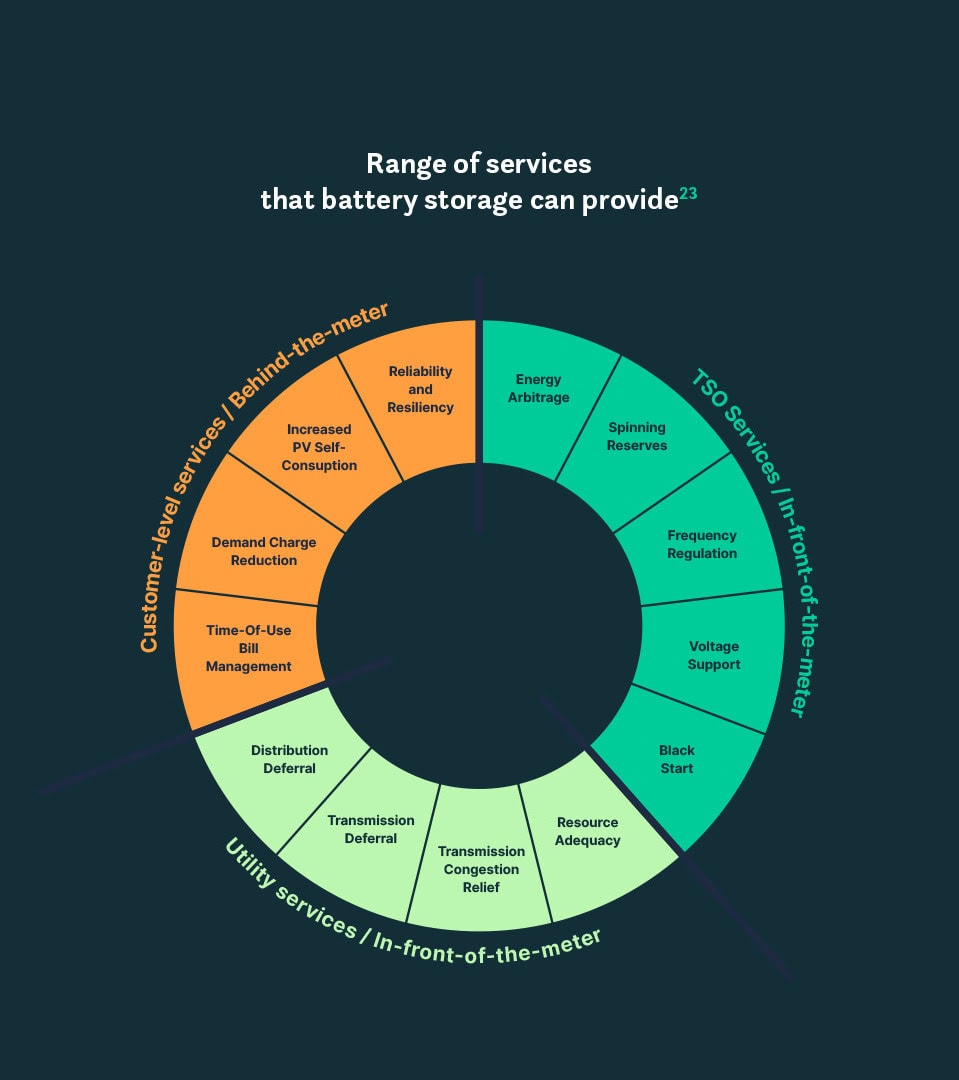
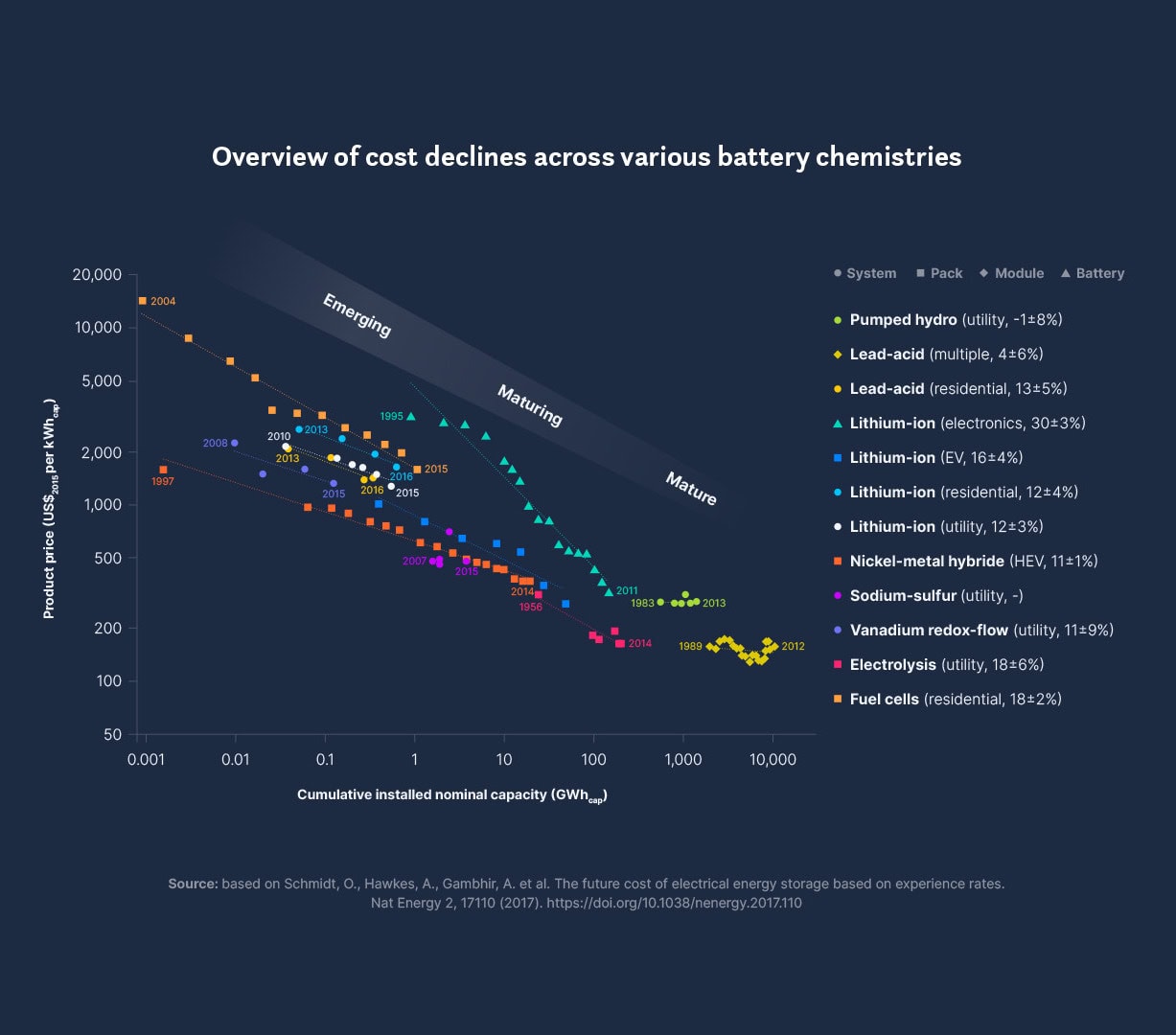
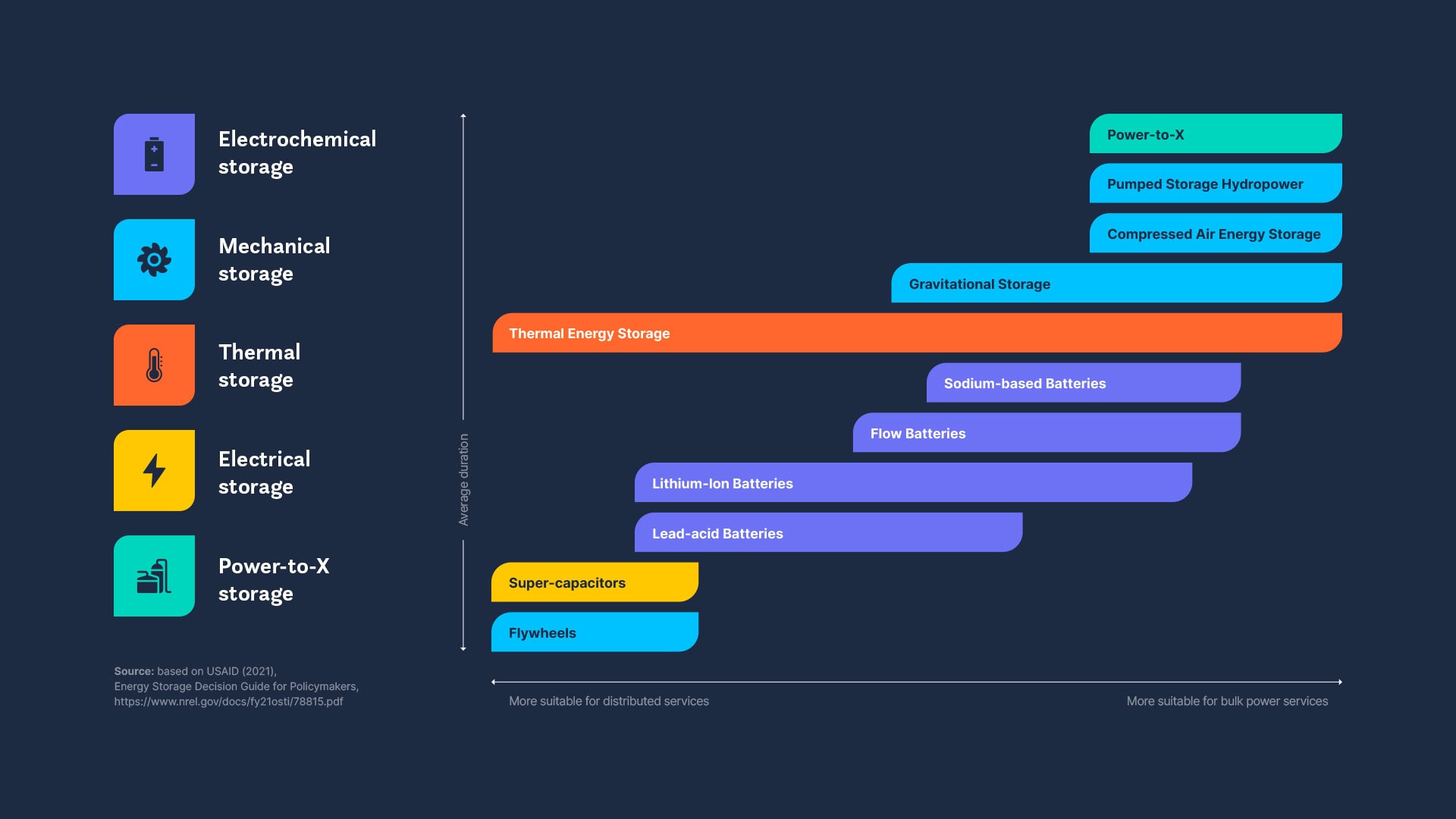
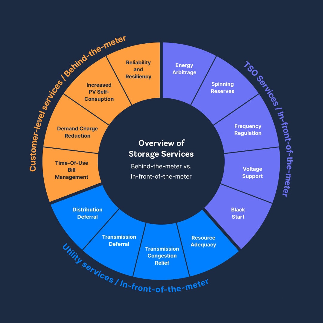
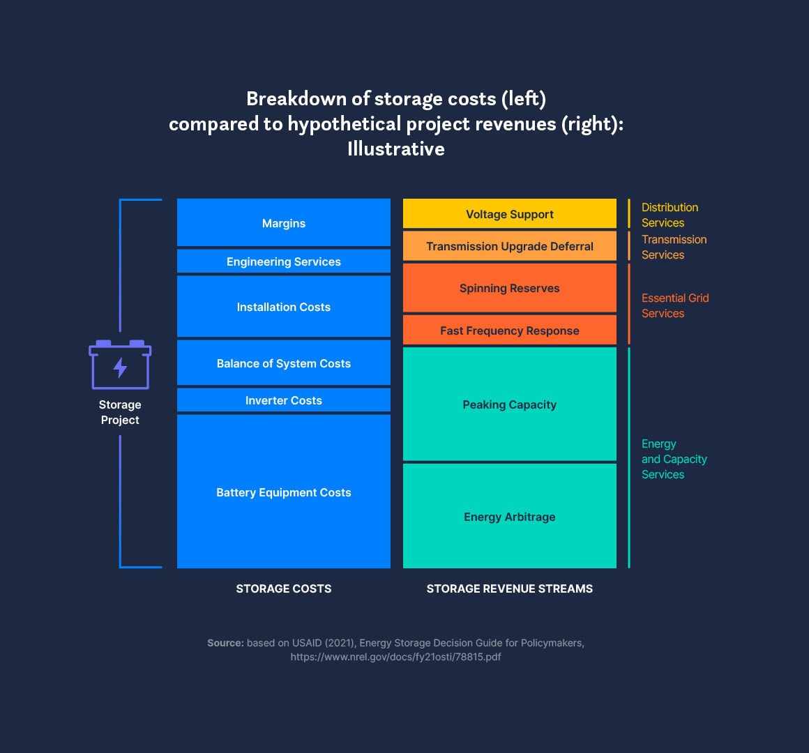
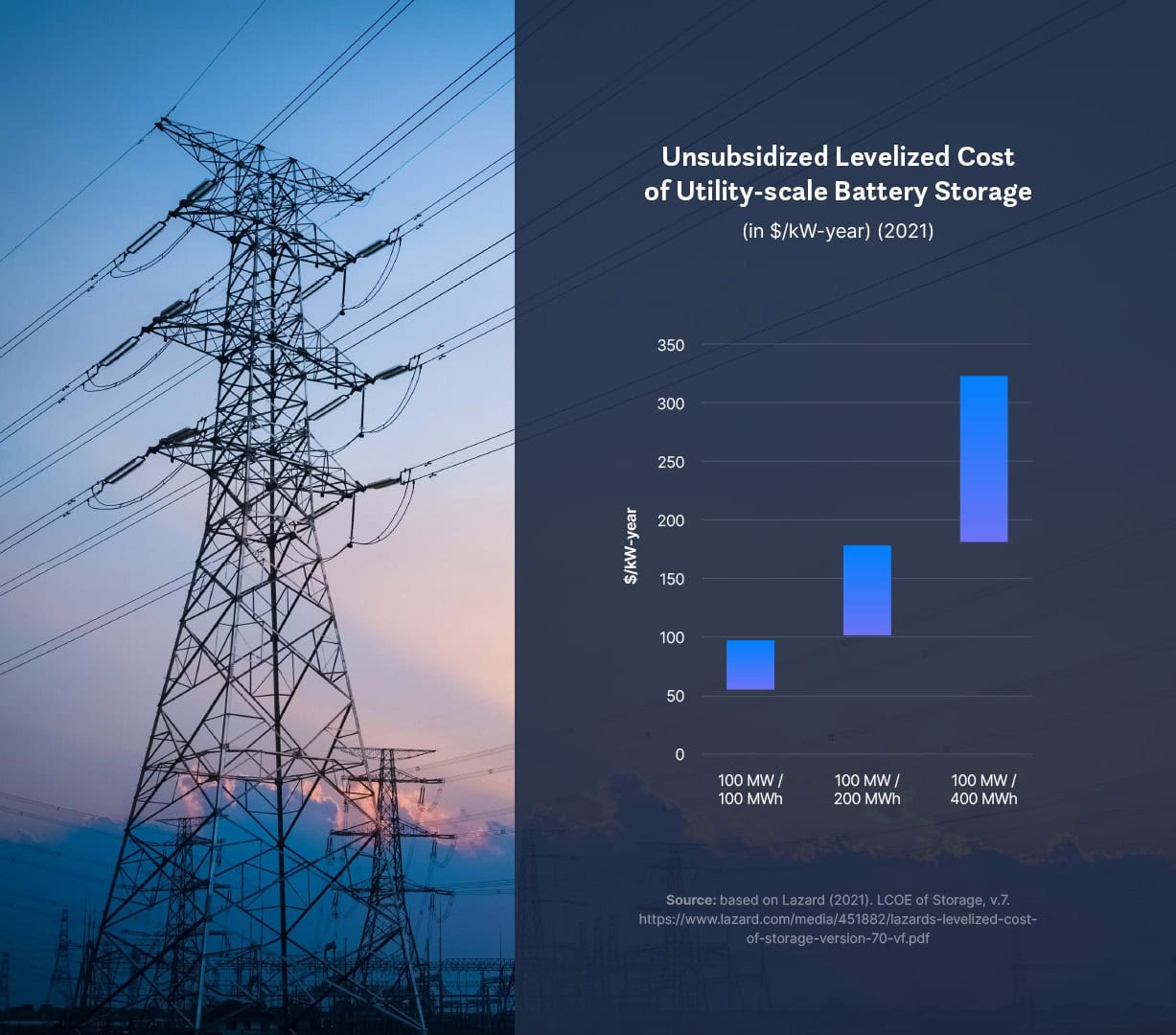
Genesis of a data-driven report, from chart unification to custom infographics, with before & after examples. Scientific data designed to support the argument.
Whatever you have. Most charts can be redrawn from images and screenshots – including charts borrowed from other publications. Original files from Excel or PowerPoint help, but they aren’t necessary. And if no chart exists yet, the data and a short conversation are enough: we discuss what the numbers should say, and I design from there. Along the way, I can crop, simplify, or combine charts where it makes sense.
Both. Most of this work happens inside larger publication projects, where it’s part of the design. But I also take standalone commissions: a set of infographics, a unified chart system, or graphics for a campaign.
Yes. I work within your visual identity – colours, typefaces, iconography – and follow your style guide if you have one. Where no data-viz style exists yet, I develop one: a consistent visual system that your future charts can follow too.
Anywhere you like. Everything is designed to work in the publication first, but standalone versions are available on request – PNG, SVG, or PDF, ready for presentations, websites, and social media.
Yes, any type – from Sankey diagrams, waterfalls, treemaps, and small multiples to process flows, timelines, mind maps, and theory-of-change diagrams. And if the right form for your data doesn’t have a name yet, that’s exactly what custom data compositions are for.
Adobe InDesign and Illustrator. Charts and infographics are redrawn as vector graphics, so they stay sharp at any size – in print, on screen, and in whatever format your publication needs.
I’d love to hear about it. Most clients reach out 2–3 months ahead of delivery, but it’s also fine to get in touch earlier, when scope isn’t yet clear. Happy to jump on a short call to talk it through, or answer questions by email.
Or email me directly at info@hot-ice.eu
Studies, briefs, and white papers where the design needs to support detailed argument and dense content.
Editorial-grade design for annual reports that speak to donors, boards, and the public.
Publications and data visualizations across writing systems, including Asian and MENA languages.
Consultations on publication flow and infographic concepts before the design phase.