I had been designing the World Future Council’s annual reports since 2018, working within their existing visual identity, building on an established template, and refining it a little each year.
Then in 2022, a logo rebrand arrived with a fresh colour palette – and everything else still open. The annual report was the first publication due after the change, and so it became the experimental ground where the organization’s new publication style would be defined. I had complete freedom to shape it.
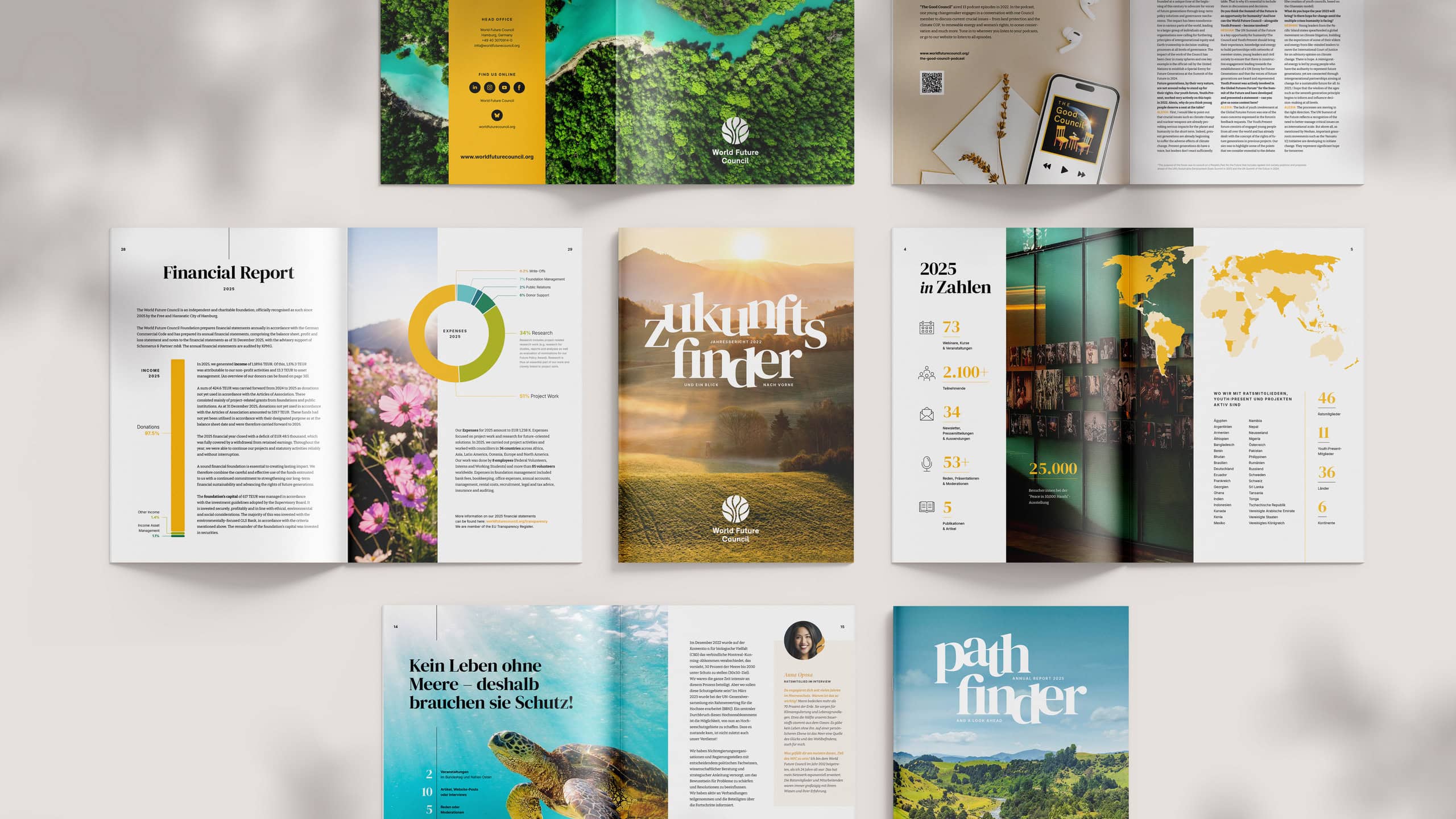
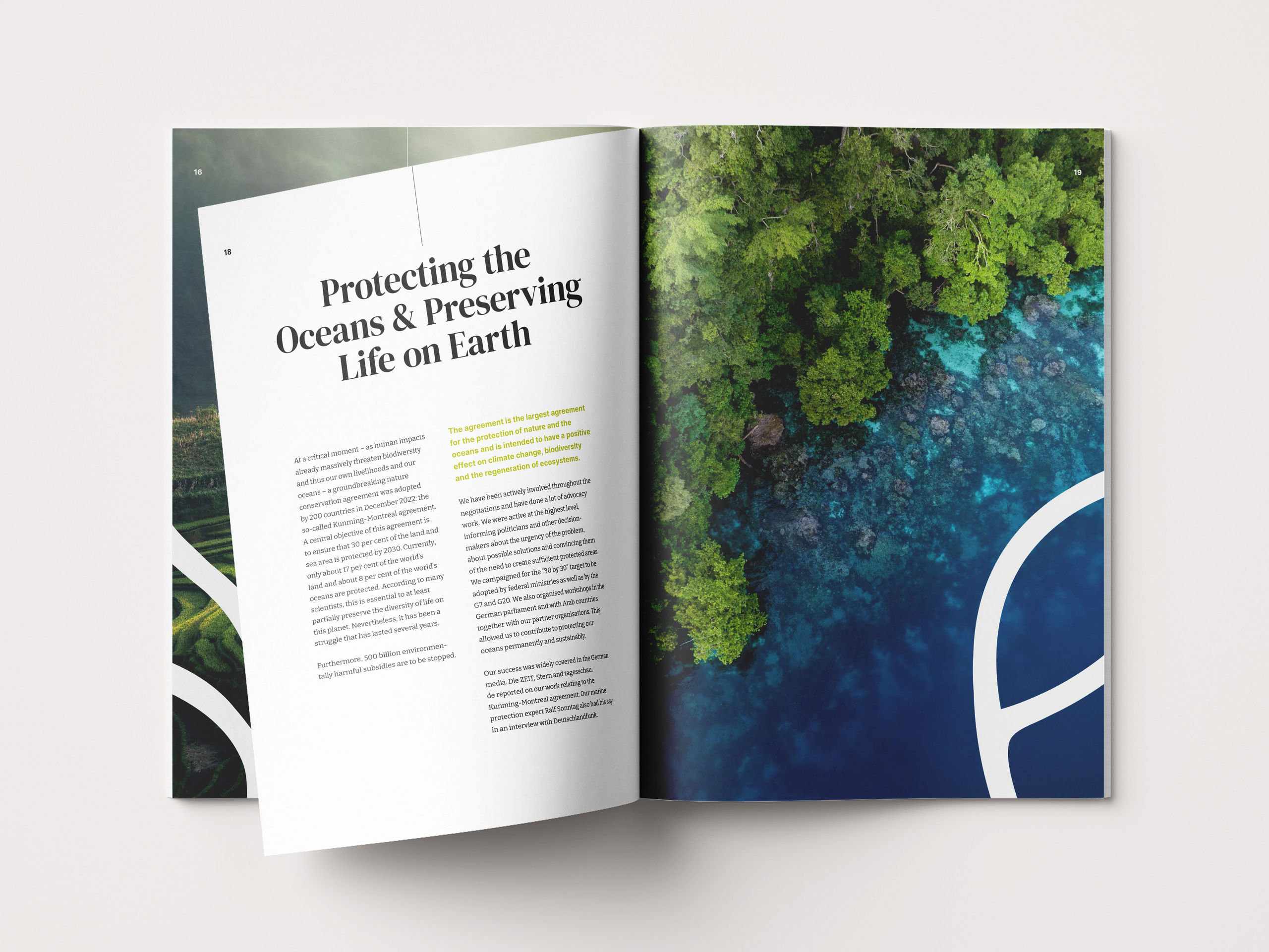
I proposed new typefaces and a more elegant way of designing: generous space, full-page photography, text that breathes. The comms direction for the year was openness rather than density, and the 2022 edition delivered exactly that – a spacious, image-led publication that showed what the new visual identity could become. The style defined there has carried the annual reports ever since.
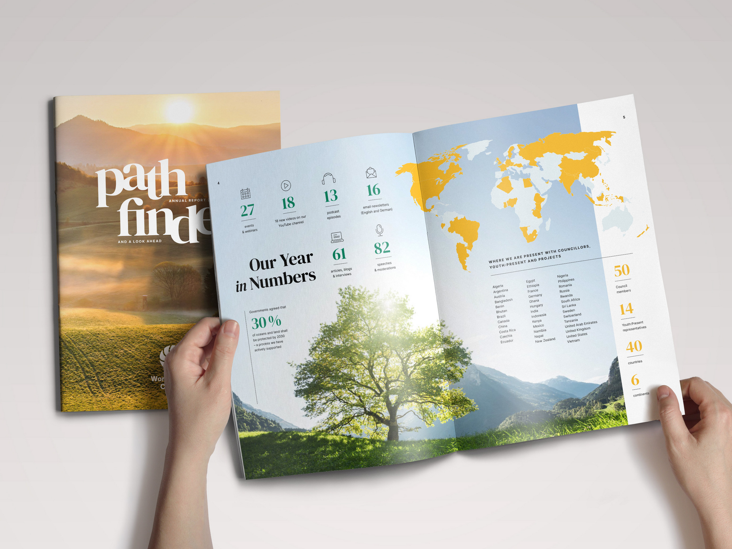
Then came the less glamorous part: keeping the style alive under pressure. Each following year brought a slightly different concept and steadily more content – more quotes, more statistics, more event photos to include. Density is the natural enemy of openness, and every edition negotiated that trade-off anew.
In 2023, for instance, each project came with its own set of key figures. We placed them directly over the project’s main photograph, so the numbers found their place and the full-page imagery concept survived.
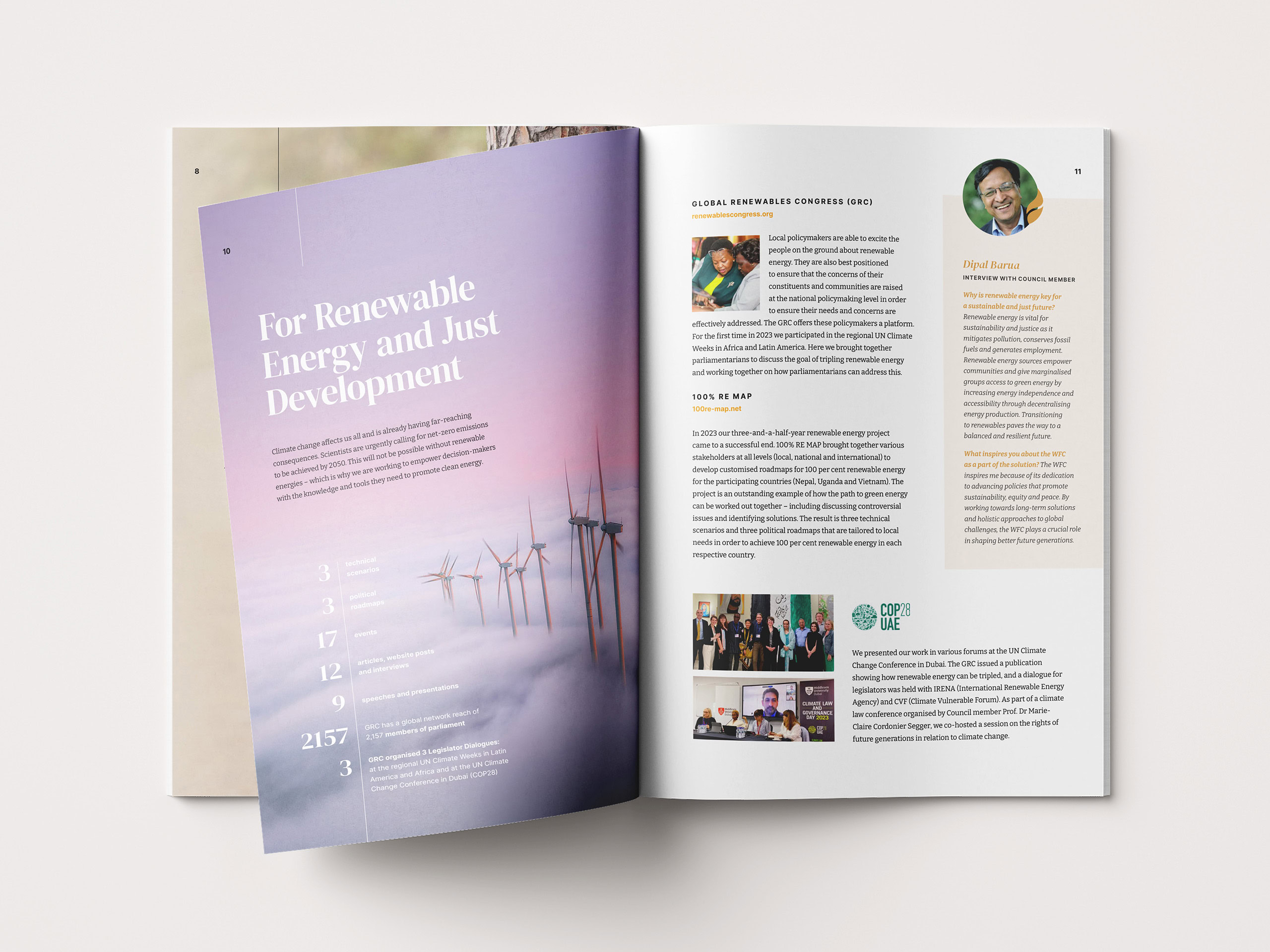
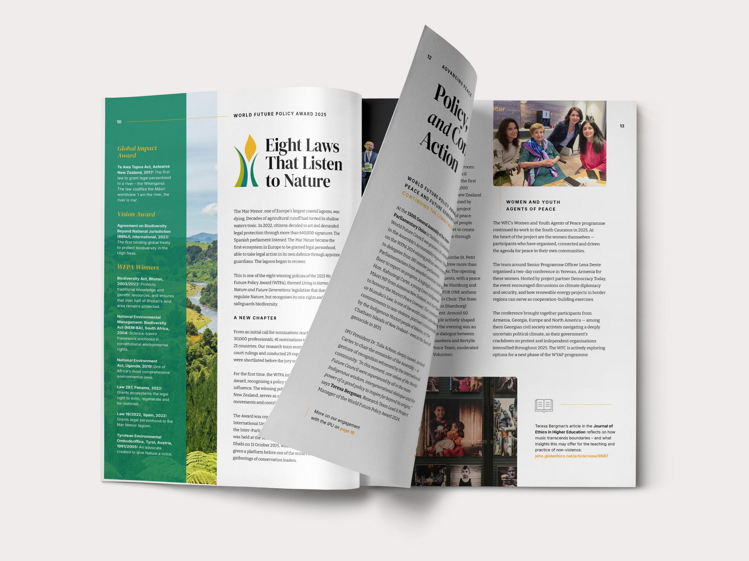
In the terms I use for annual report projects, this series is one Reinvention followed by years of Evolution – a new visual language built once, then flexed annually as the organization’s story changed. Even pages that typically stay the same across editions can gradually change shape over the years.
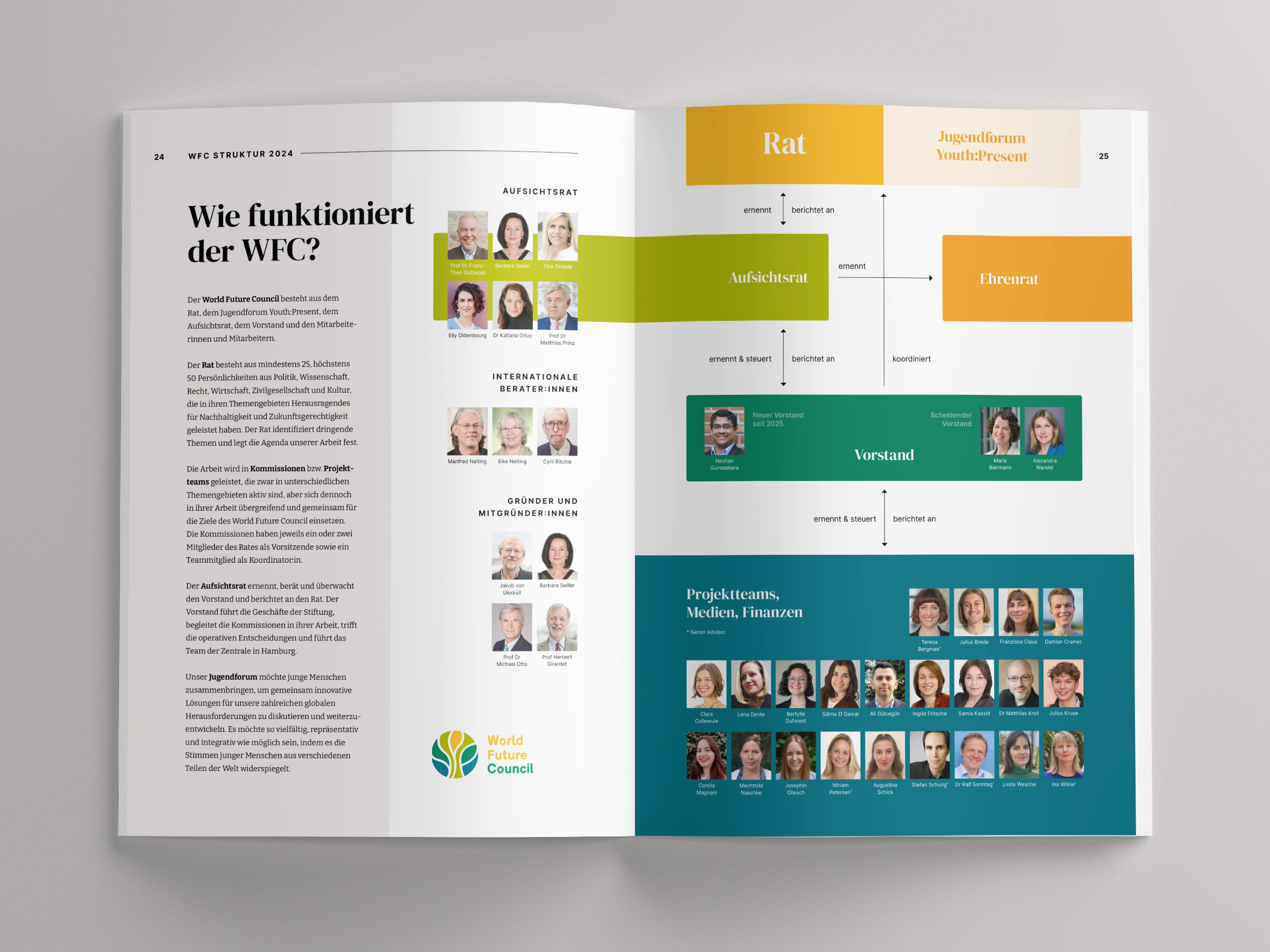
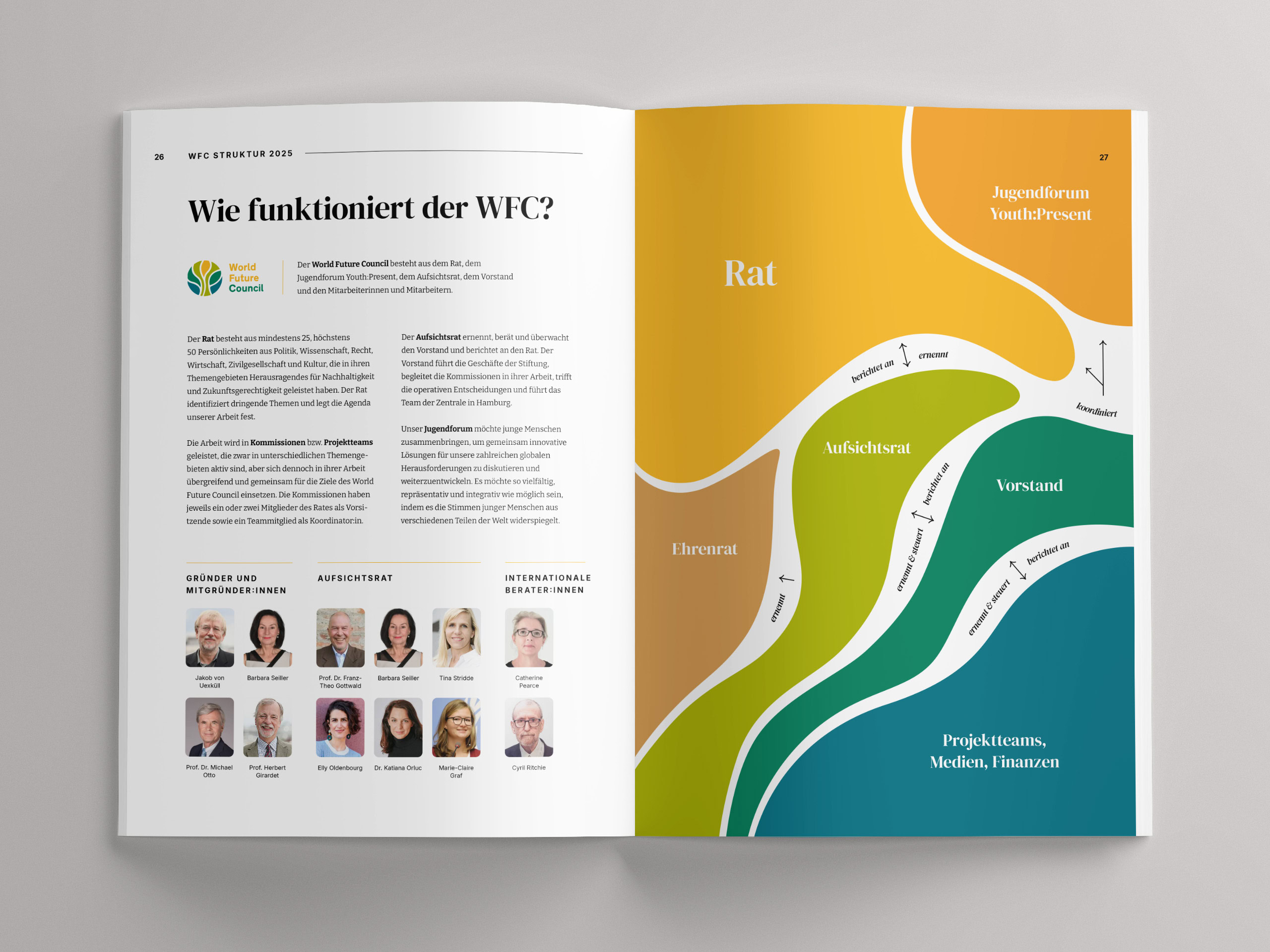
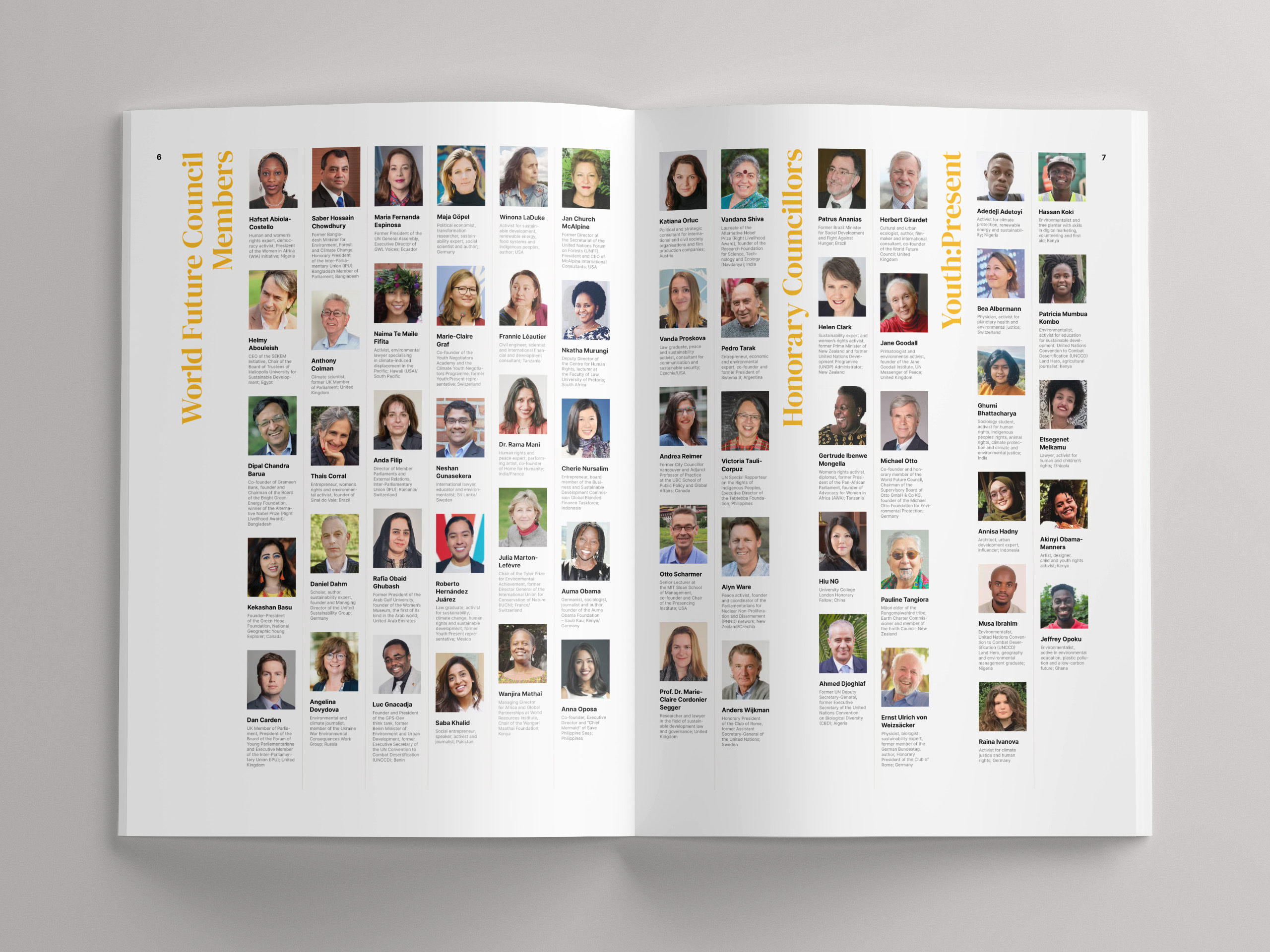
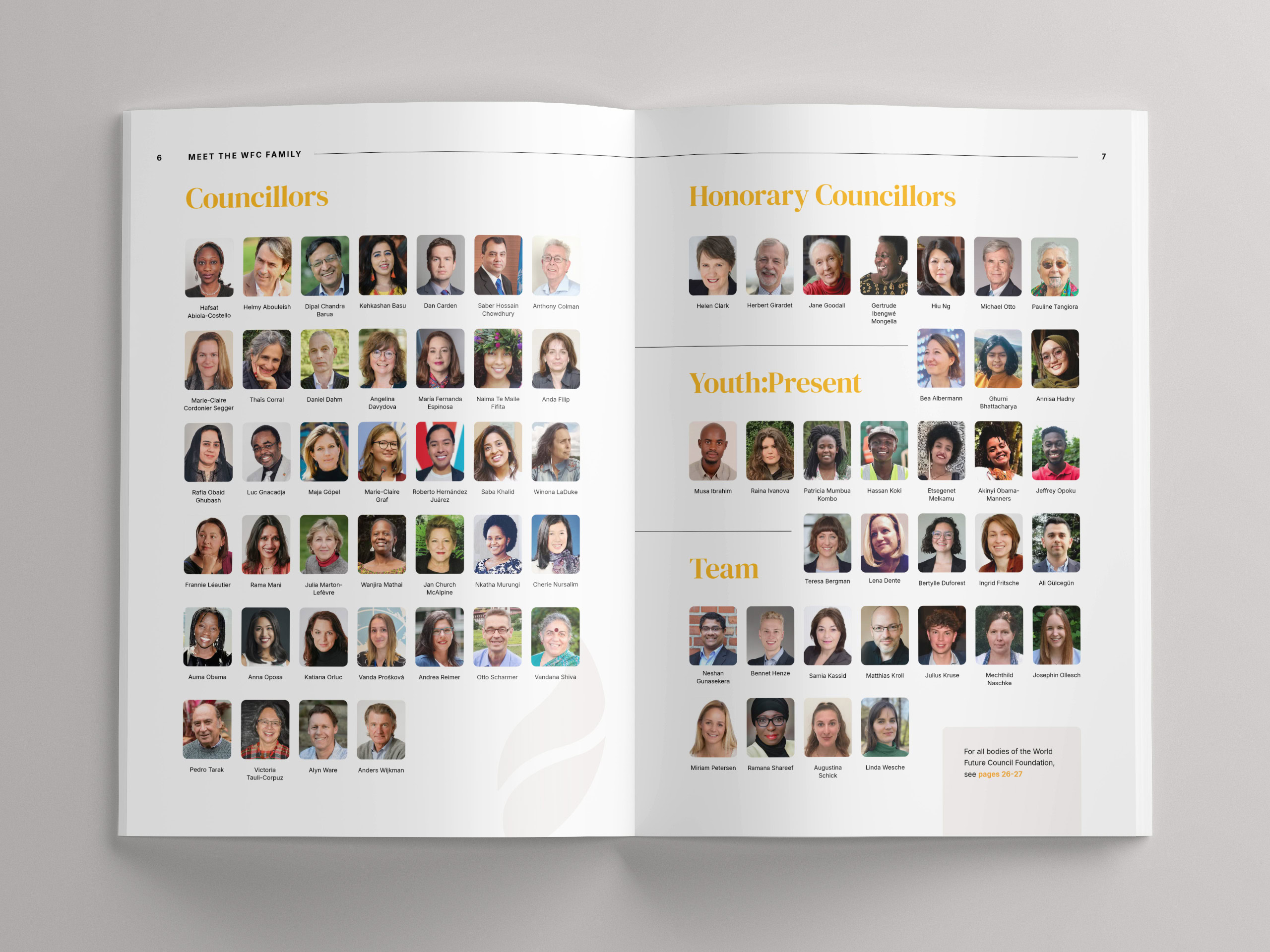
Each edition comes in English and German. In practice, the bilingual workflow mostly means planning for length, since German tends to run longer. More on that in multilingual design.
Part of the credit belongs on the client’s side. The World Future Council prepares its content exceptionally well: structured, portioned page by page, with a clear concept for the year. A report that arrives in such a state loses no time to untangling, and all the hours can go into the design itself.
“Jana is an exceptional graphic designer with an outstanding skillset as a visual story-teller. Working with her is a great pleasure — she combines creativity and originality with problem-solving, efficiency, and reliability. Her designs are clean, yet warm and full of beautiful, subtle details.”
Miriam Petersen, Senior Communications Consultant, WFC
What happened next
The series continues, with a new edition each year. You can download the reports on the WFC website. The visual language was designed from the start to reach beyond the annual report. Today it also carries the World Future Policy Award publications I design for WFC each year.