
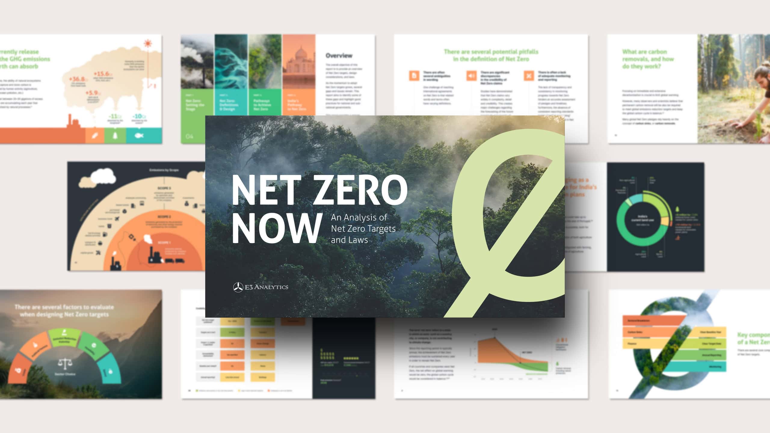
E3 Analytics specializes in research on energy technologies and climate policy, producing reports that aim to be short, clear and understandable without giving up academic rigour. Our cooperation began with a series of reports on power storage technologies and has continued for years across a range of reports and issues.
The client’s format of choice for most reports is sleek, data-rich slide decks – built to be read on screens, page by page, argument by argument. My job is to dress them in a unified design language, and present the data in the most intuitive and striking way.
This case study features examples from a mix of publications. The before/after sliders show the original PowerPoint slides, shared with the client’s permission, next to the delivered design – one example for each kind of work. Drag them.
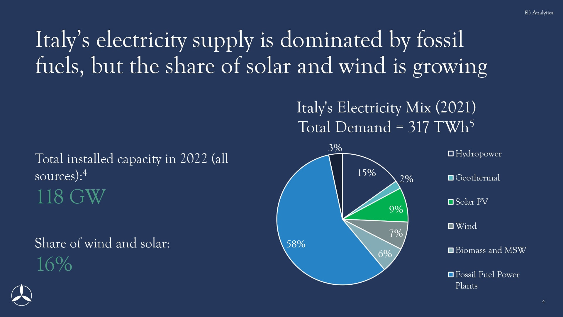
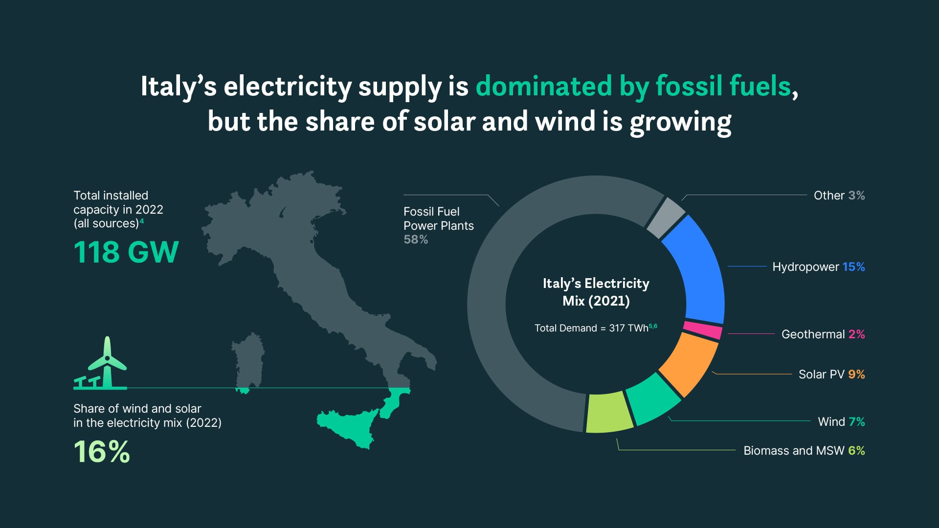
One style for every chart
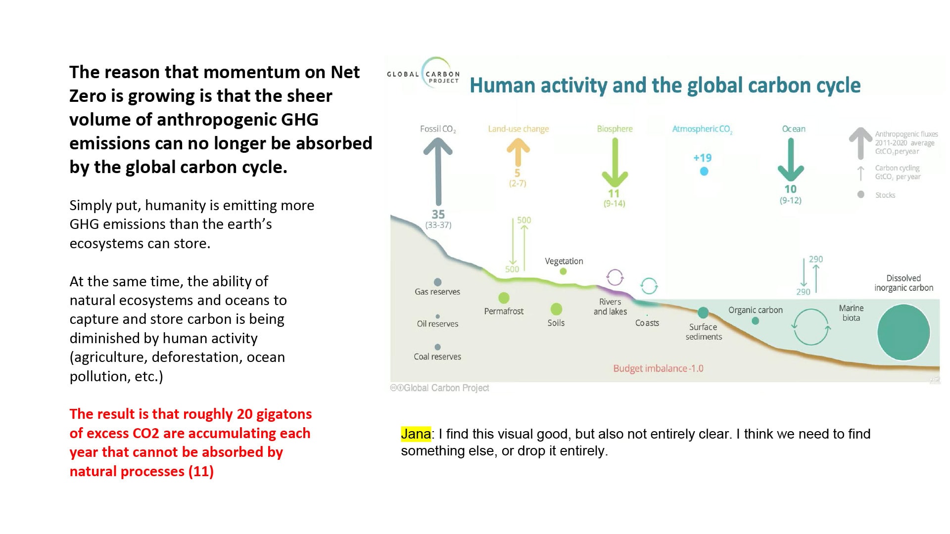
Research reports draw data from many sources, and charts arrive in many forms – original Excel charts, screenshots, or figures borrowed from other publications. The baseline of my work on every report is that each figure is redrawn into one unified visual language, gaining quality and resolution on the way. The report reads as one publication, not a collage.
Numbers given a shape
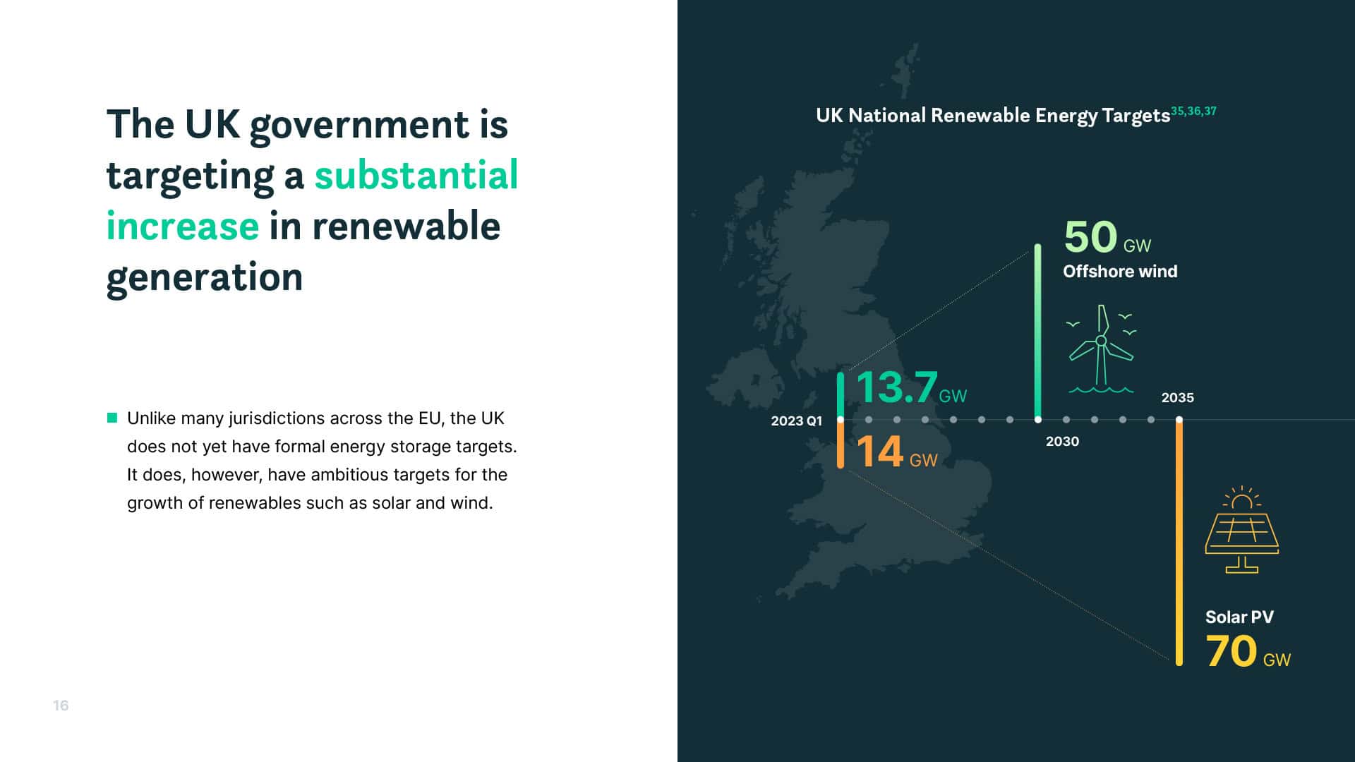
Where the data allows, I go beyond redrawing: key figures get a visual form built for them, so a reader senses the scale just by looking at the page. This is the custom data composition work I consider the core of my data practice.
Complex schemes made understandable
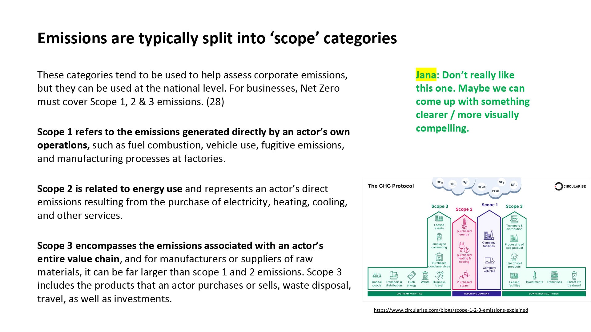
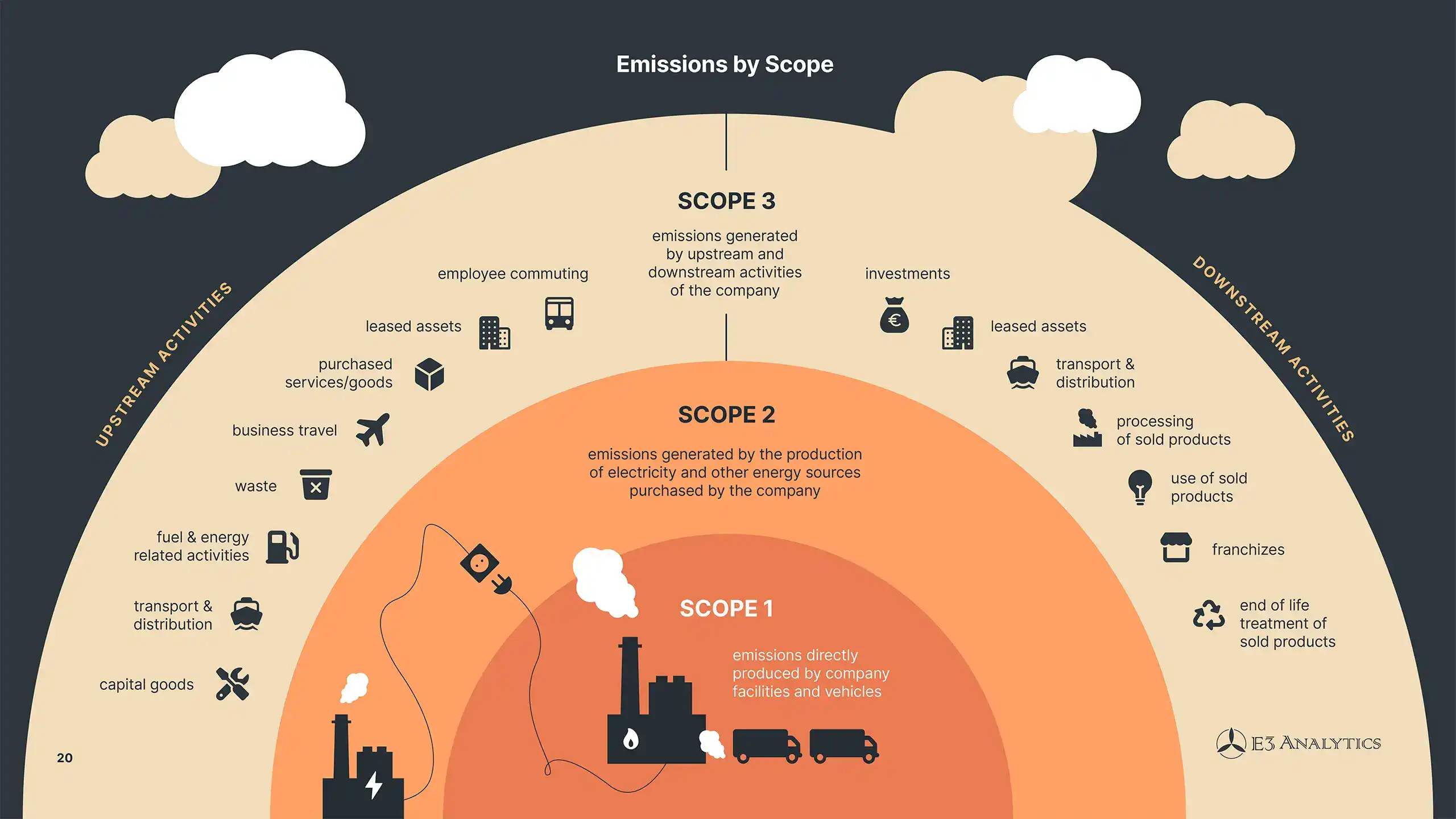
To explain a system, process, or a set of indicators, the report often requires more than a simple figure. In these cases, I design custom infographics or icon sets that cover the whole concept. In the example here, several paragraphs and a borrowed diagram became a single full-page infographic.
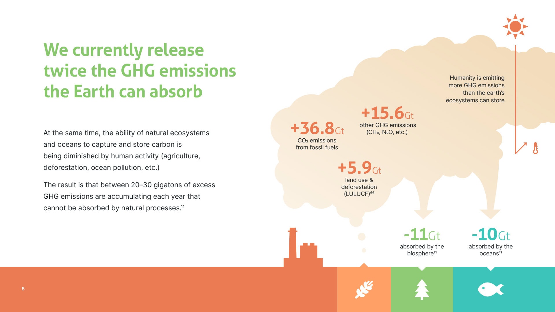
Concepts created together
Sometimes no existing form fits the message. In this example, the client knew what he wanted to show, but no visualization of it existed anywhere, only data scattered across several sources. In working sessions we curated the numbers together and built a bespoke visual concept to carry them. It’s the kind of collaboration I offer as conceptual partnership.
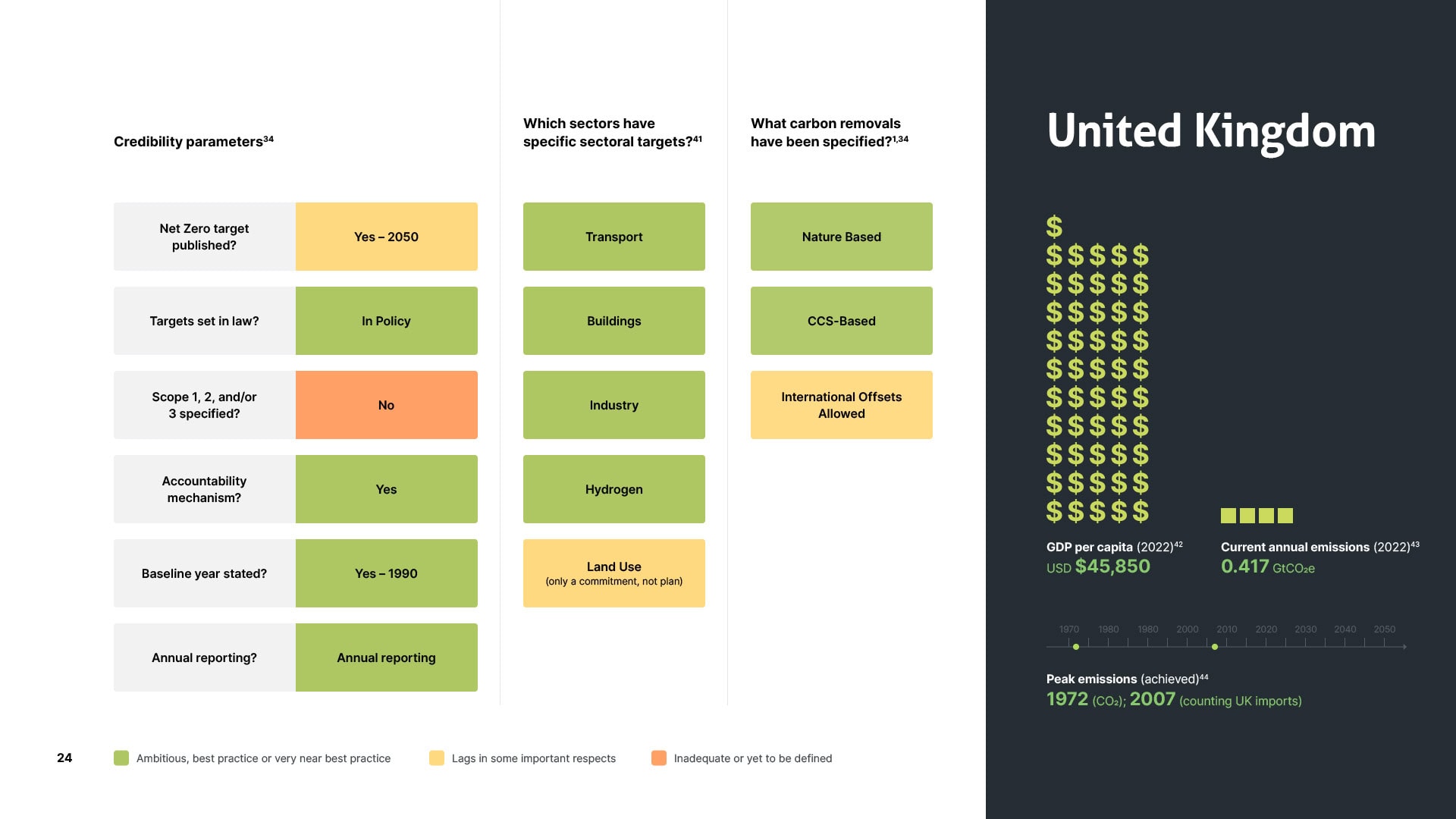
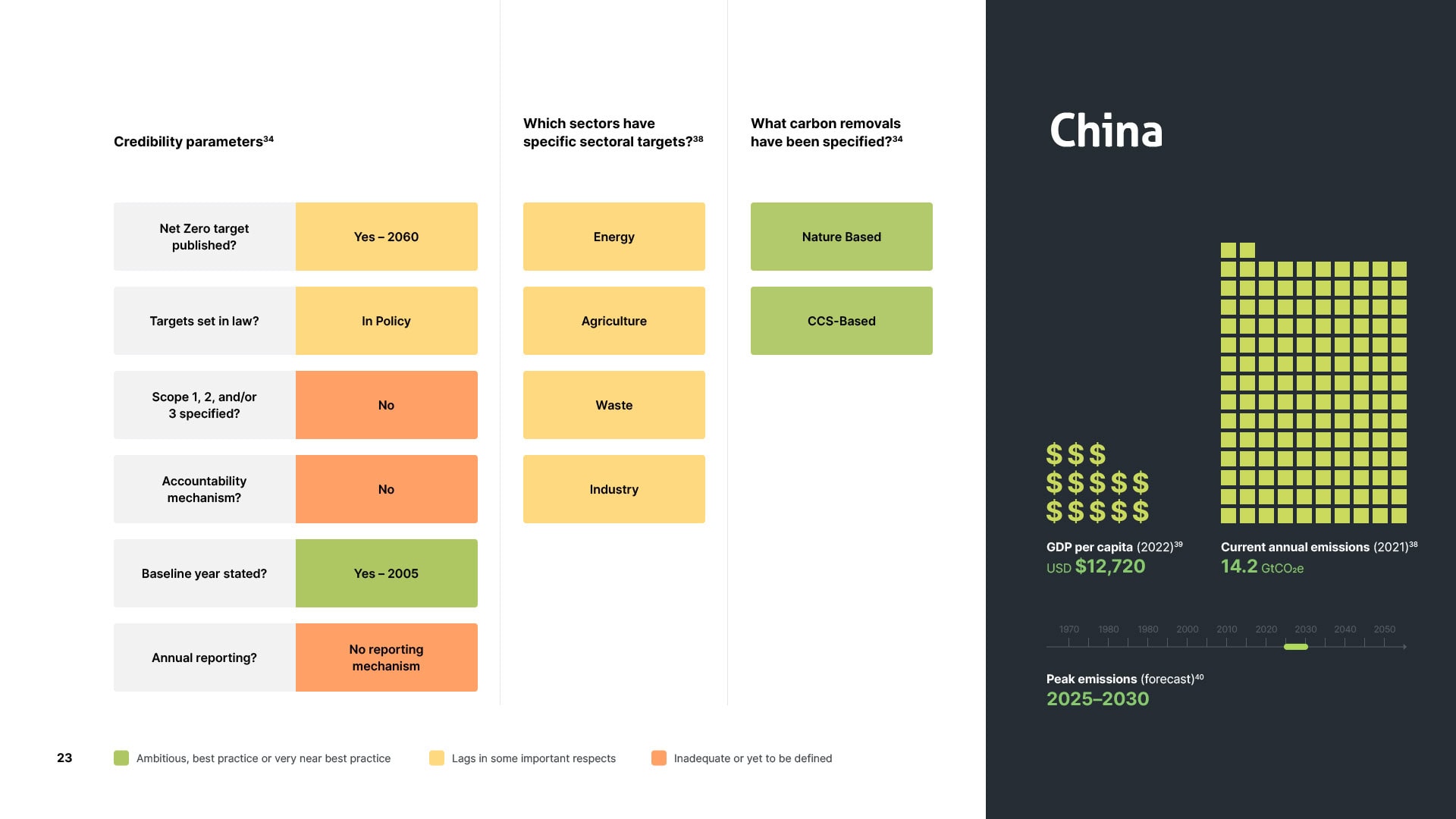
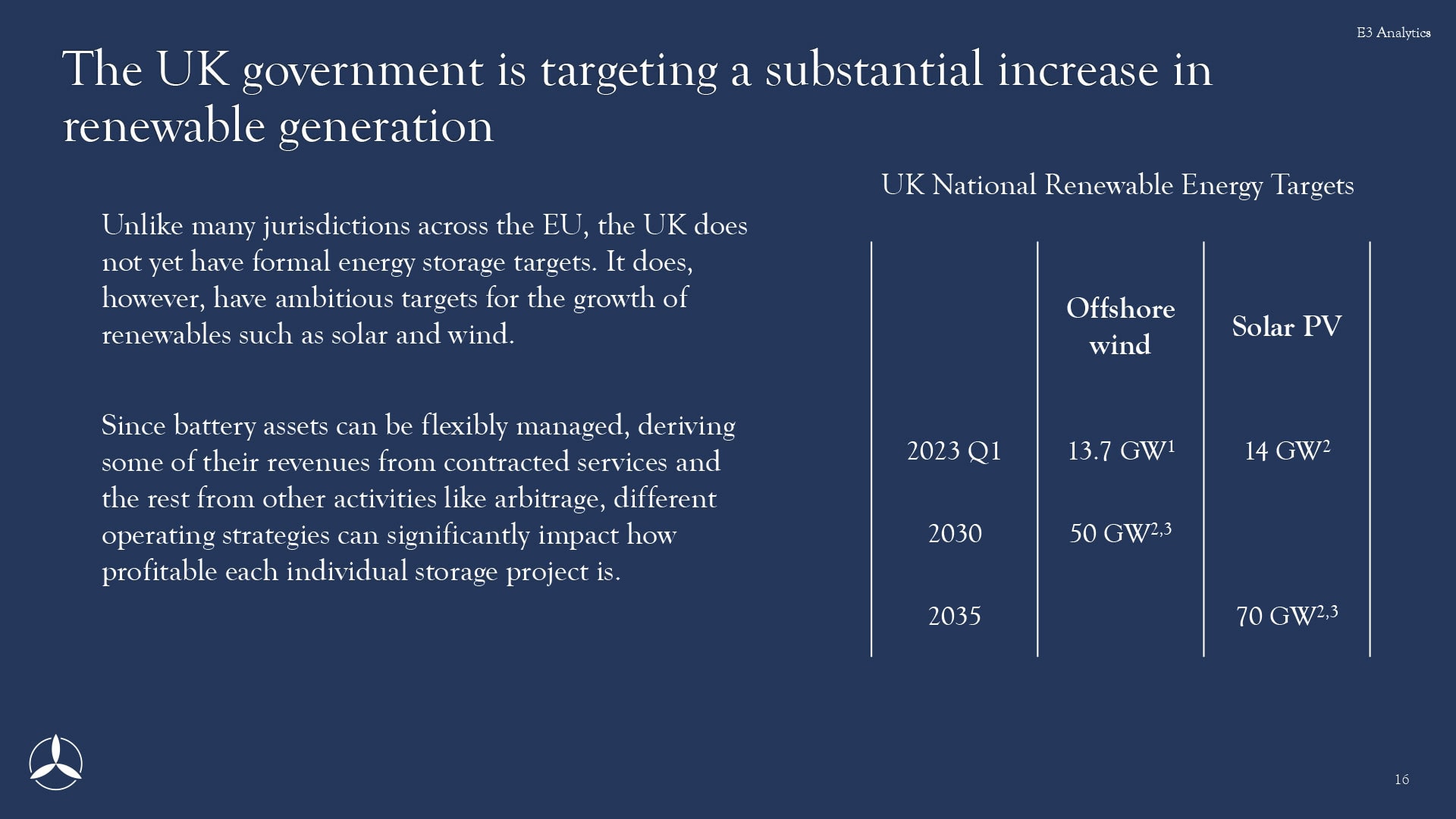
Comparison that travels across pages
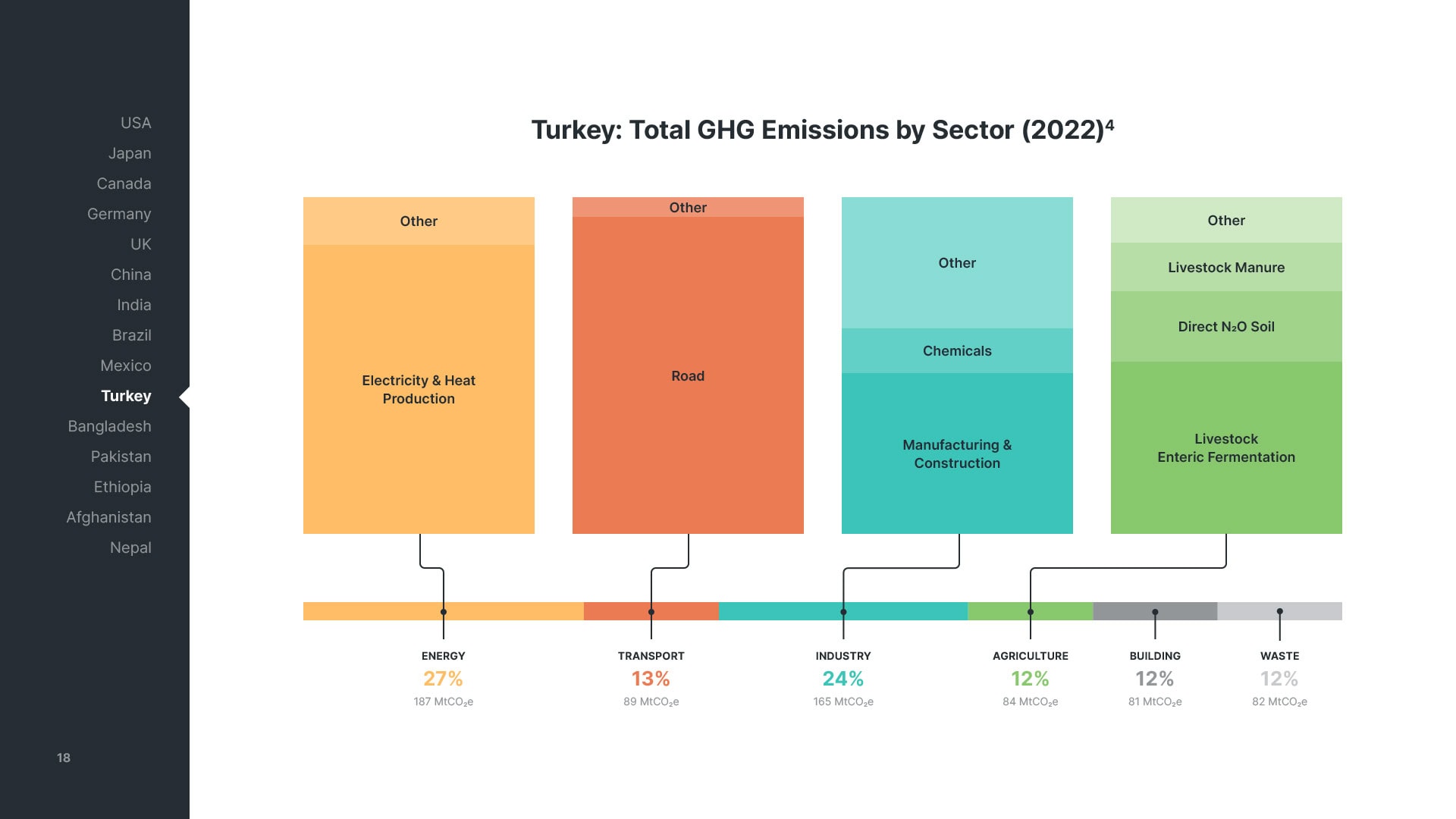
When presenting the same type of data across pages, visual cues such as colour and scale make the comparison more intuitive. Flip between UK and China and the differences register instantly, because everything sits in the same place at the same scale.
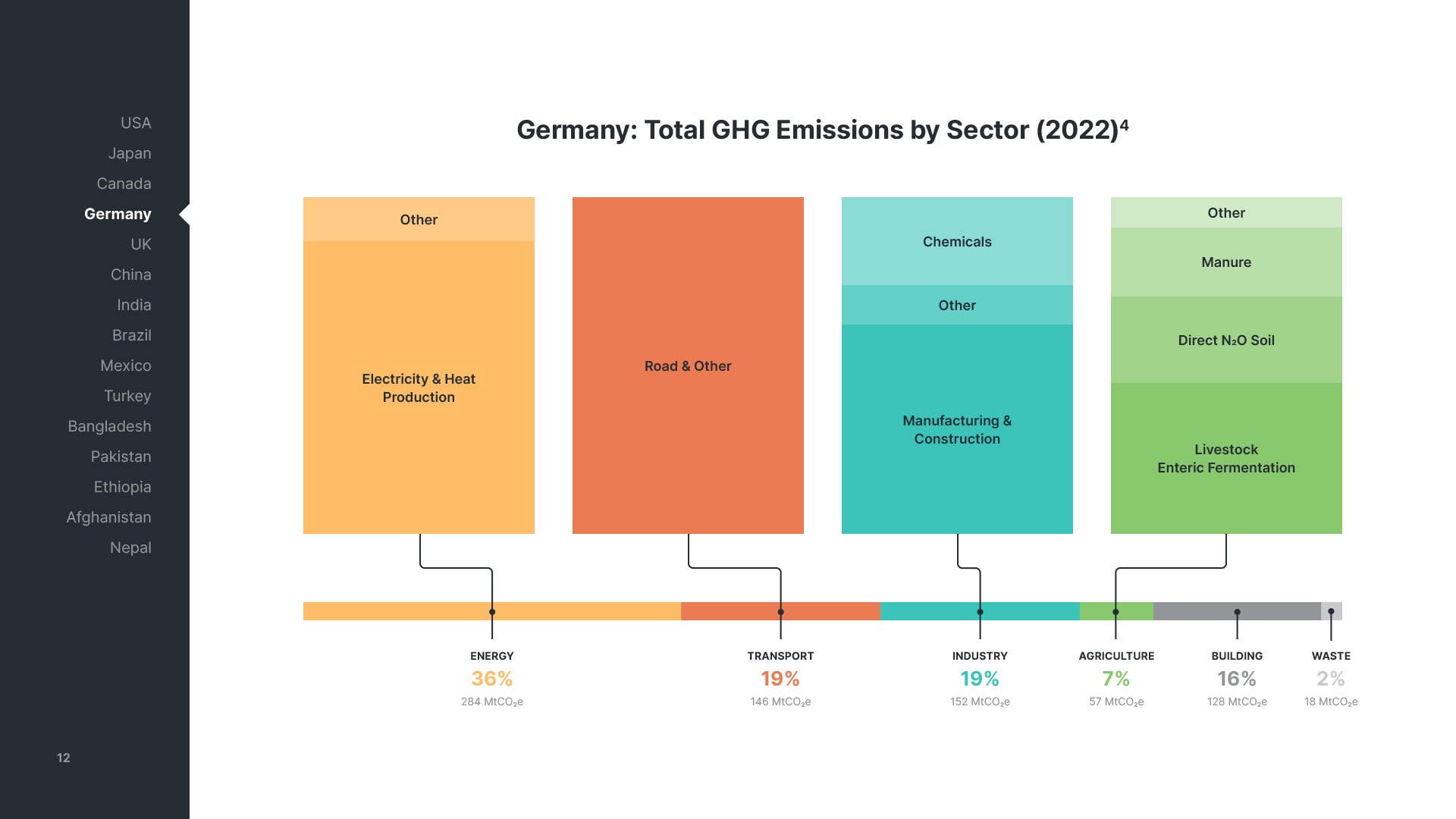
Interactive navigation
Longer reports and comparative sections benefit from persistent navigation elements. In this example, a sidebar sits alongside all country profile pages, marking where you are and making it possible to easily switch between any two pages in order to compare them. This is a kind of navigation you’d expect from a website, built into a PDF document.
“Every time I've worked with Jana, she's gone above and beyond to take the graphics, the aesthetics, and the product design to the next level. It feels like we put forward copper, and Jana helps us turn it into gold.”
Toby D. Couture, Director, E3 Analytics
An ongoing cooperation
Our cooperation is ongoing – new reports, same principle, the data in the leading role. See Power Storage Report, Country Reports, and Net Zero Reports in my portfolio for more examples, or download the full reports from E3 Analytics’ website.