
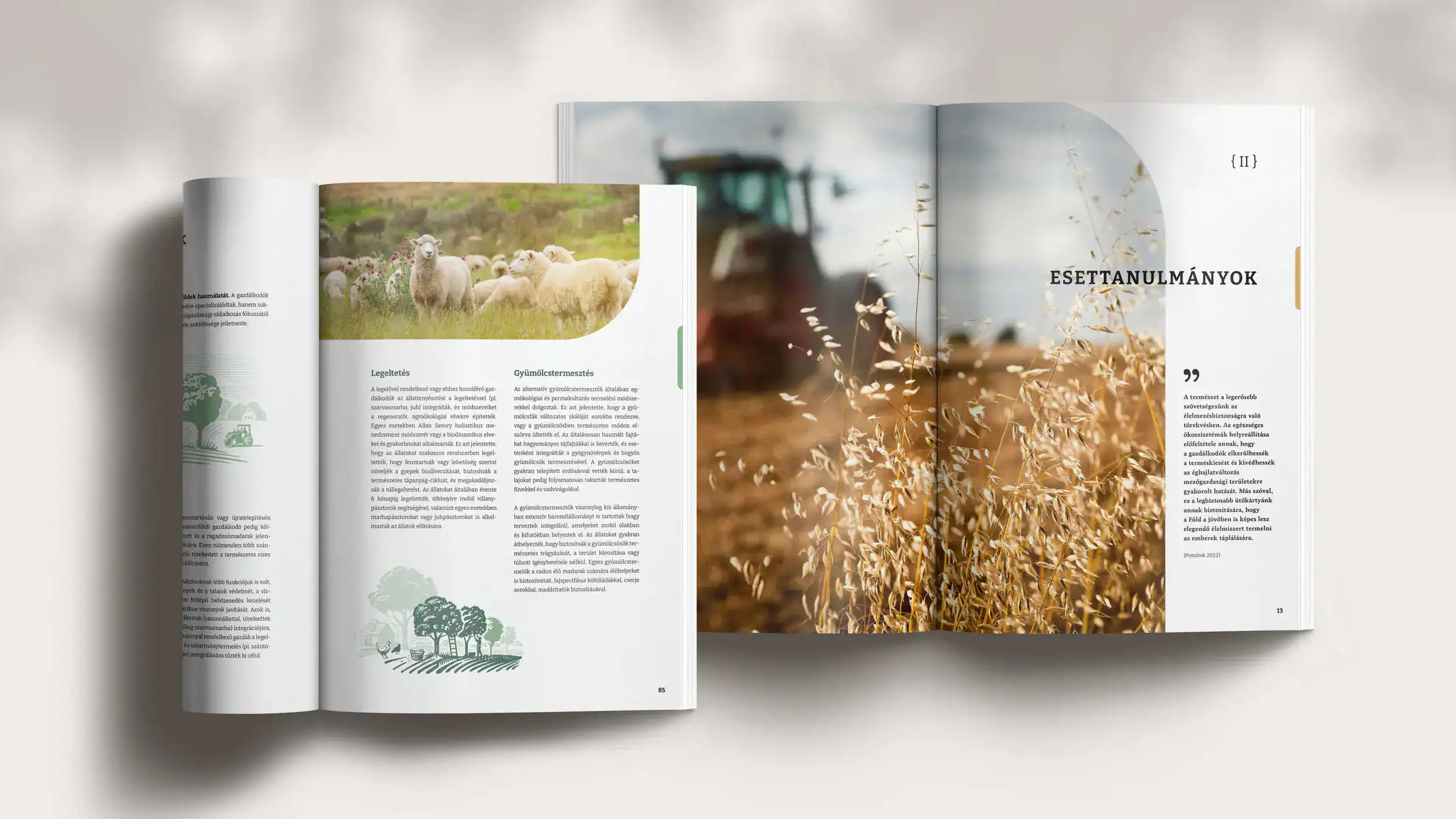
In the world of think tanks and academia, style often comes as an afterthought. The research is the core of a paper – but words alone don’t always carry the message to the people who need to hear it. Good layout does quiet work: readability, orientation, visuals in the right places, and the signal that these ideas deserve to be taken seriously.
Mariann, an independent researcher, came to me on a colleague’s referral while finalizing a comprehensive report on alternative agricultural practices in Hungary, an analytical study paired with a series of in-depth farmer interviews.
The report wasn’t tied to any organization’s house style, so we had complete freedom in design. And because she reached out early in her drafting process, we could shape the publication itself before design began – the kind of collaboration I now offer as conceptual partnership.
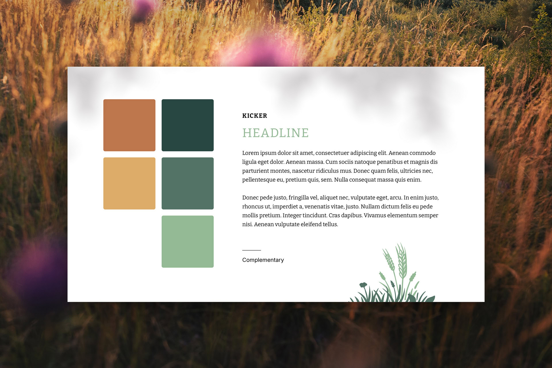
Visual style and palette tailored to the audience
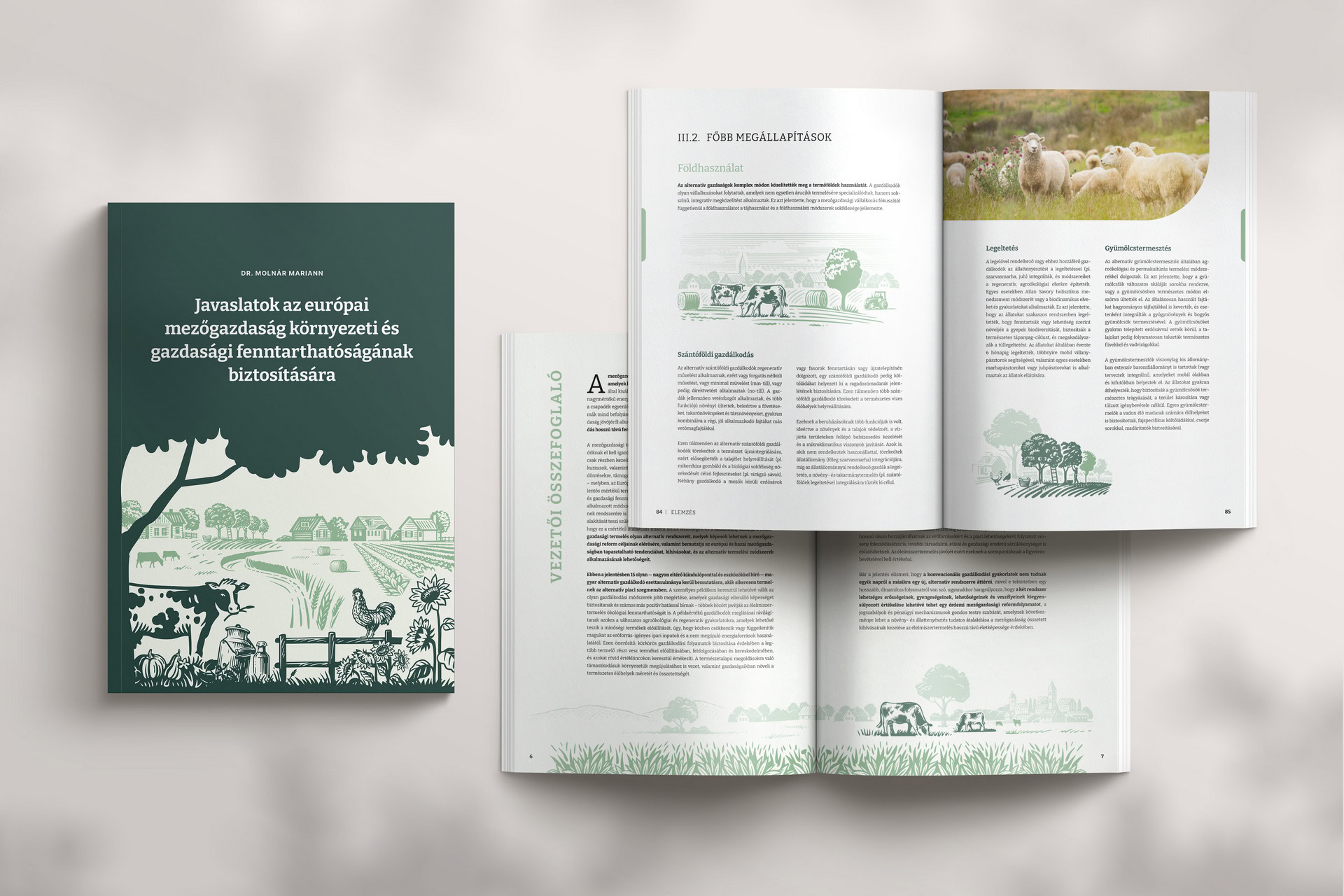
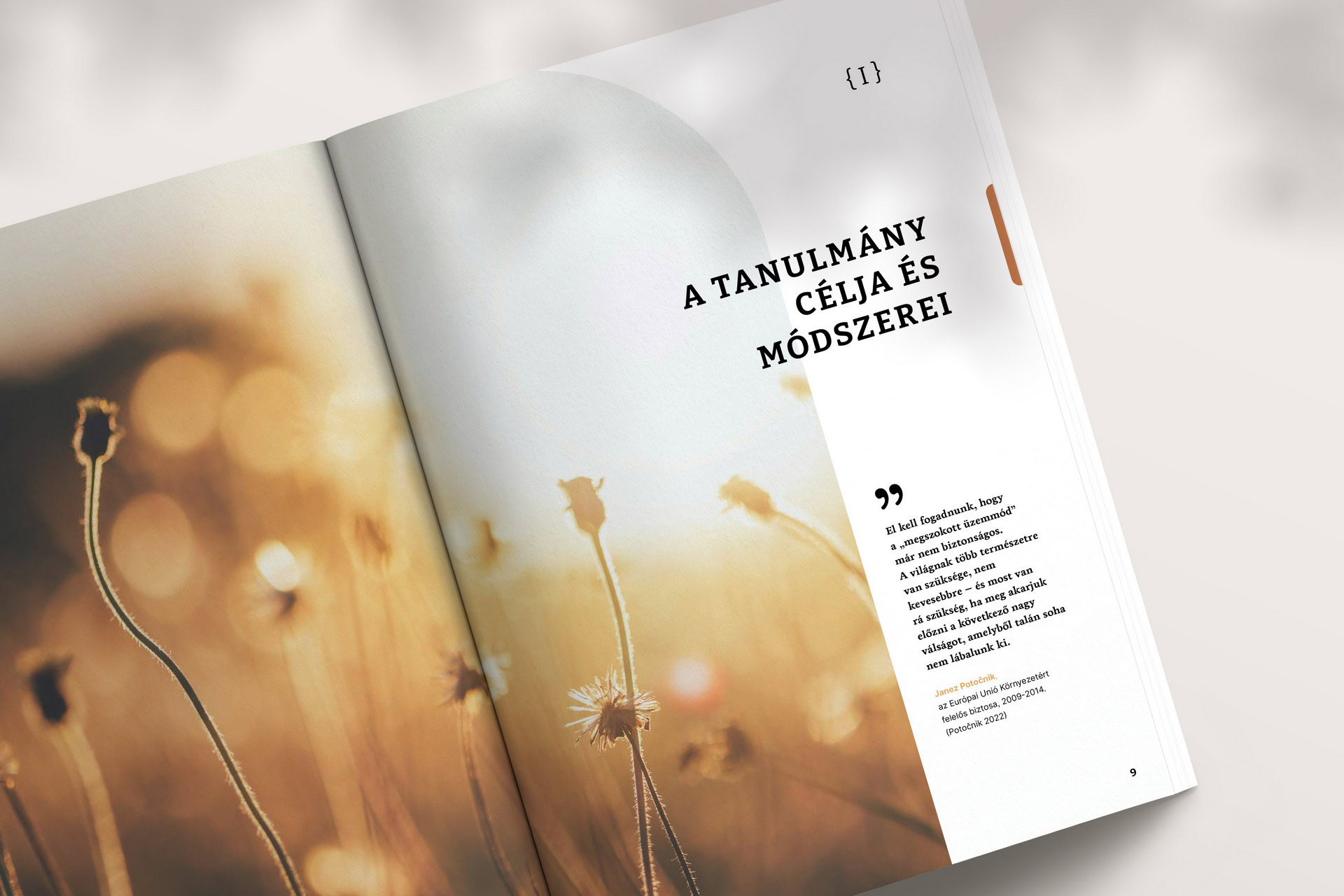
The audience was clear from our first call: farmers and policy makers. I proposed an earthy palette, soft but warm, and photography with a shallow depth of field – a visual language that feels current and familiar, rather than academic. The main font is a slab serif with a hint of farmers’-market vibe, yet fully readable in print and on screen. Geometric arches throughout give the layout a gentle nod to contemporary design.
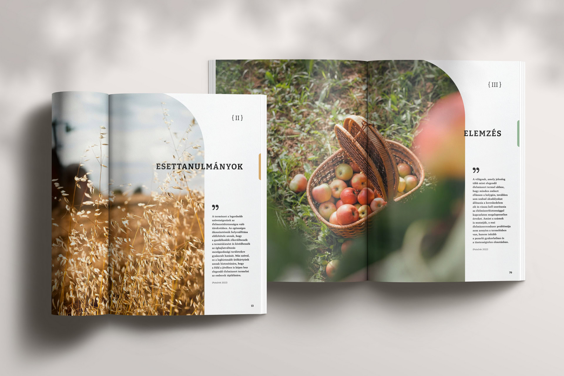
Section dividers and cues for better orientation
We structured the report into main chapters with subchapters: Aims and Methods, Case Studies, and Conclusions. Each opens by a large section divider and is colour-coded with stripes running along the page edges. A reader flipping through the printed book can land in the right chapter by colour alone.
An icon system for indicators
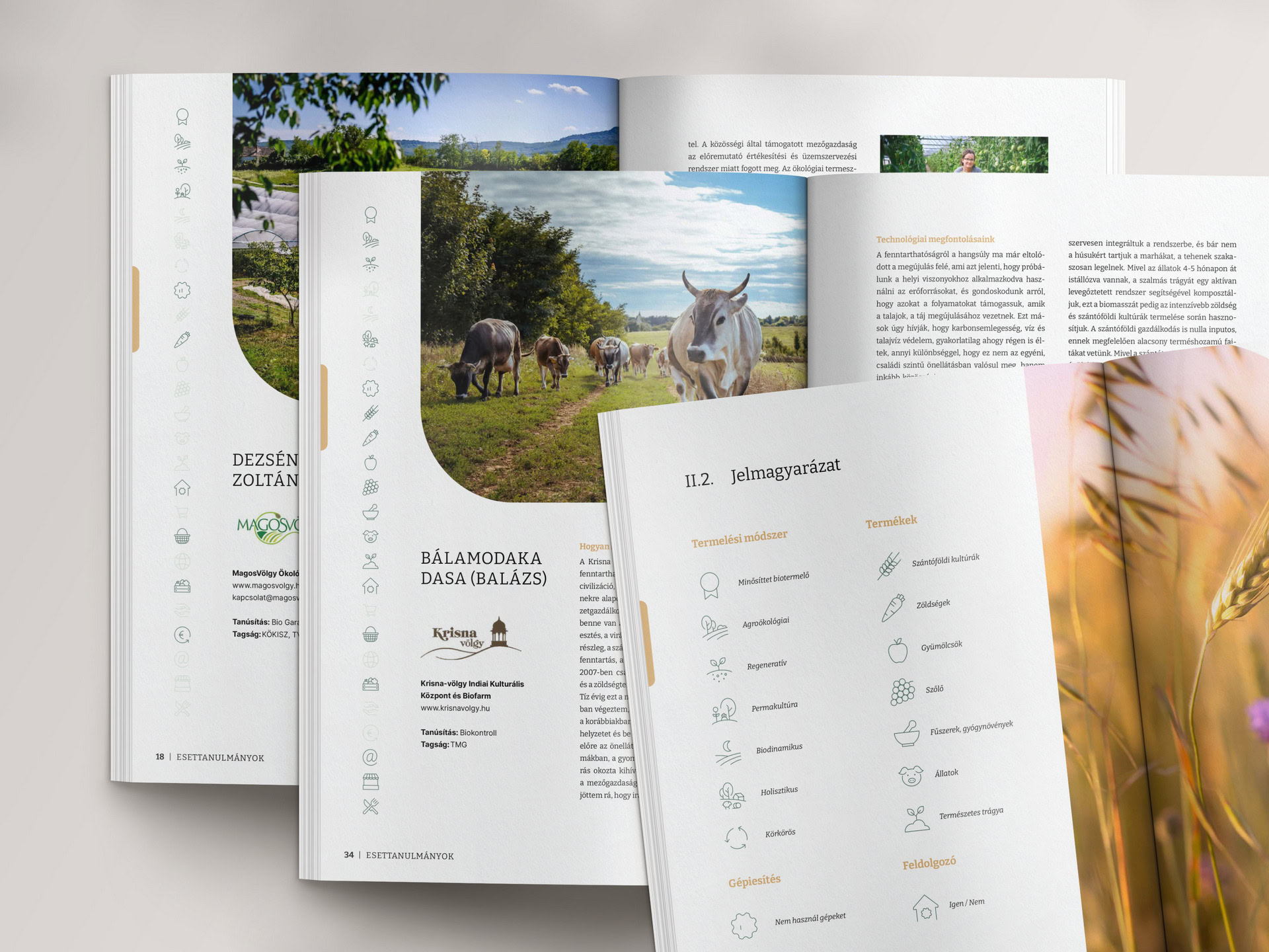
Mariann arrived with a spreadsheet of 25 indicators for every farm, and a request to somehow fit the table into the book. I proposed we not fit it in at all. Instead, every interview opens with the same profile page: a column of icons, one per indicator, where the icons that apply to that farm light up. Readers can compare farms at a glance as they flip through the book.
This is what I call persistent visual systems in my data visualization work.
Illustrations composed to explain
Some ideas in the report needed showing, not describing – above all the contrast between large single-crop fields and diverse, mixed sustainable farms. Rather than commissioning custom artwork on a researcher’s budget, I licensed a coordinated illustration set and composed the scenes myself: small vignettes through the chapters, larger compositions where an idea needed room. The cover is built from the same system, so the book announces its visual language before it’s opened.
Designed in a language I don't speak
The book exists only in Hungarian – there is no English edition, and I don’t speak the language. I worked from a reference translation, set the text according to Hungarian typographic conventions, and relied on Mariann, the author, as the native-speaker reviewer in every revision cycle. That’s the working method behind all my multilingual design work: I don’t need to speak a language to typeset it well; I need to know its rules and build the review into the process.
“The entire process was fantastic! I came to Jana with more than 100 pages of dry text and finished with a report that brings all my case studies to life. Jana is an absolute joy to work with. She is completely in tune with her clients, highly creative, and thoroughly professional. I could not be happier with her work.”
Mariann, independent researcher
What happened next
The report went to print in 2023, and it’s also available for download. The collaboration continued with a follow-up Action Plan, and a publication on Farm Animal Welfare.